Great Design

Welcome to Great Design. This website will look at the best designs on the internet. As well as tutorials teaching you how to produce amazing designs and get good looking results.

Advertise On Great Design

Dec 30, 2007

Hey There

I've got a bit fed up of Google Adsense at the moment since it isn't paying out very well. As a result I want to set up some direct advertising. It isn't going to cost the earth and I will show you a couple of funky shiny graphs and lots of maths with big numbers to try and get you to place down your hard earn money.

What You Get

All adverts on the site are 125px x 125px. The adverts are placed in two different places. At the bottom of every post or on the left hand side in the sidebar. These are priced at $10 or $15 per month respectively. There are two different places since the sidebar image is displayed on every page but the cheaper priced option only appears in the blog posts.

At the current statistics there are 38,000 page views and 24,000 visitors as shown in the image displayed below (click for the fullsize image) per month.


As a result you get a very cheap cpm (I can't work it out at the moment since my calculator has broken). For people who are interested in page rank and seo my blog is currently rated at pr 3 although I expect this to climb in the next rank update.

The Rules

There are a couple rules which you should abide by. No adult related links. I like to see this blog as family friendly. Porn is not family friendly material. Graphics should be supplied in .jpg .gif . png and .bmp. You can have animation but it should be simple and is subject to approval. I will review your website and graphic so make sure it works. There aren't many rules so try and stick to them. Payment is by PayPal and is to be paid in advance per month.

Ok Give Me The Spot

If you want to advertise on Great Design you can drop me an e-mail at jamespowell100@gmail.com prices are $10 and $15 for either a blog post advert or a sidebar advert. You can have a combined discount of $20 if you pay for both. I'll be waiting for your email. Remember its a first come first serve basis.

New Design Has Been Created

Dec 29, 2007

Hey There

I have finally finished the design for this blog. It took a lot longer than I planned but I have nearly got it perfect. There are a couple of problems that need to get ironed out but it is nearly done. As a result either tonight or tomorrow i'll install the new design. As usual there will be some problems. So lets serve this as an advance warning if things look a bit screwy.

If any problems do crop up, then you can just leave a comment in this post or any others. Its taken me a while to complete so I hope you guys like it.

A Cool Texture Site

Dec 27, 2007

Hey There,

I hope you are all refreshed from Christmas. I am. Anyway, onto the first post for what seems to be a long while. This is again another website review (website reviews are great since you get to find cool design websites which you may have otherwise missed.)

This website as stated pretty much in the title is all about textures. Textures are great because they can be used to liven up backgrounds, 3D models and just about everything else. The website I am talking about is Cg Textures. Its a very big directory based site that gives you access to lots of free textures. Free being the best word in the previous sentence. The quality and use varies between sections. Some images are really good quality some, lack the brilliance of some of the photos. But you can't beat free.

There are a couple of catches. For example at the moment you are only allowed to download 30mbs of images a day. Its 15mb starting the new year. I think they have done this to stop people mass downloading hundreds of files. Its a small catch but I think they have our best interests at heart.

Anyway to round up. CG Textures if definitely worth a visit. You may need to dig deep to find the good quality stuff.

Colour Curves - How To Pick Good Colours

Dec 24, 2007

Hey

I love working with color, you can express so much emotion and feeling with the colours you chose. But picking good colours is hard. As a result I've come up with a formula that seems to work, and helps a lot in picking the colours you can use for you graphic design applications. I call it colour curves. Due to the imaginary curves you can follow to help pick good colours. I'll give you an example of how to use it.

First lets take an example of the main colours you can use when picking a colour for your artwork. You have red (shown twice), pink, blue, light blue, green and yellow. These are shown in the arrows below.


If you pick the most "extreme" colours, that is putting the pointer in the very top right corner. You get the very bright colours as shown below. These colours are OK, but you don't really see these colours in everyday life. They are two bright an vibrant. They do have there uses. But we need more subtle and slightly postal colours.


My method for picking good colours is to use colour curves. I've added them on the image below. These are imaginary curves that you can use for picking colours. For example if you pick the top curve you get slightly darker but less extreme colours. If you chose the bottom curve you get very dark colours but they are softer and not as harsh. The middle line is a bit of both.


As a result you get colours that are a lot softer. I've gone for the top line, although for a better comparison I could have picked colours that are lighter. But if you compare this chart with the originals they are softer. These types of colours would look a lot better than the ones used above.


This is just a simple idea that I wanted to share. Please leave a comment with your thoughts.

P.S I'm sorry for the lack of posts. being the Christmas Holiday i've been very bust relaxing and working. There should be a couple more after Christmas and Boxing day.

Pingdom - Website Load Speed Tester

Dec 20, 2007

Hey

Its important for a web designer that a website loads quickly. Every remember the 4 second rule for websites? If a website doesn't load (or nearly all of it) then a user leaves. Most of the load time depends on a server but a lot of it can be sped up by finding out what time it takes for things to load. To enable you to do this quickly and effectively, this tool pingdom, is perfect.

What the tool does, is analyse the load times, from first connect to the last byte, of every element on your website. It the presents this in a a cool graphical manner for you to analyse and find out what is happening in terms of time.


This tool is really great. For example from the above graph I can see that one element of my site is taking a really long time to load. This can then be debugged and changed in my code. A better example of this was the reddit widget on my site. Before I found and used this tool, my site would take ages to load, over a couple of minutes. This code helped a lot.

I would definitely check this site out. Its is a really good tool to have in your design arsenal. Pingdom.

How To Be A Freelancer (eBook)

Dec 18, 2007

Hey

You may remember yesterday that I mentioned about How To Be A Rockstar by Freelance Switch. This post is just going to be a summerizing post about the book which I failed to mention about yesterday.

The book (with one of the best names ever) is all about the introduction into freelance work. Freelance work is all about working for yourself by getting work all on your own. This is also known as self employment but freelancing sounds so much cooler. It goes through all of the different the topics on Freelancing from beginning to end. There is 11 chapters of pure goodness.

Its written by the chaps over at Freelance Switch and PSDtuts. I'm going to order mine soon (paypal funds need to clear first) and I can't wait to get reading it. It has received some positive reviews from what I have been reading so I can't wait to get into it.

If you want to visit the sales page for ever so slightly more information you can find it here, if you want to directly buy it with out all this waiting and reading you can go directly to the paypal website where i've lifted the URL, its found here. It is $29 which is a bargin, I have seen eBooks priced way higher than this and a lot worst in quality.

They are soon going to bring out a book about wordpress, I haven't used wordpress but it is probably as good as this one. Please leave a comment of what you think, i'm interested in your opinions.

How To Eat Rockstars - Photoshop

Dec 17, 2007

Hey

While surfing the web I came across a book by Freelance Switch. The book is all about being a new person into Freelancing, what interested me most is the book cover (other than the cool book). Its simple and easy to do. The following tutorial will try to emulate the effects found in the cover design. Its very simple and uses some common effects for creating stars. Every iteration of this will be different, so yours could end up completely different to mine. You will need one shape (the rockstar) i'll provide a link to it when we get to that stage. This tutorial is quite long since I wanted to explain everything.

Step 1) The first step (as always) is to create your canvas. Make it taller than it is wide, i've used about 500px x 800px.

Step 2) Colour the background black. This is going to be the base colour.

Step 3) Create a new layer this will be for the noise. Fill this layer (again) black.

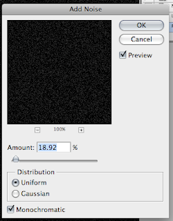
Step 4) Go to Filters > Noise > Add Noise. Make sure the colour options in your sidebar is black and white. Add some noise, not to much, you don't want to over whelm the page. This will be used to make the big stars.


Although you cannot see it very clearly in the image below you want to keep the noise to minimum. Having to much noise will make the next layers a mess.


Step 5) At the moment there is to many white blobs on the page to be any real use. To counter this me need to fatten them up. Go Filters > Blur> Gaussian Blur. Set the blur to a low amount around 2-3 pixels and click ok. This will reduce the amount of blobs and fatten a couple of them up.


Step 6) There is still to many at the moment (they are the right size). Go Image > Adjustments >Threshold and reduce the slider. This will take some time. You need to move the slider so there is some stars but not to many or not enough. Take your time at this stage to get a good amount.


Step 7) Apply a Gaussian Blur once again to soften the edges of the blobs. You now have big stars.


Step 8) Repeat the process again by creating a new layer, filling it black, adding noise etc etc. In the noise stage add more noise than you did the first time. It takes a bit of work and a lot of undoing to get a good effect but work on it.

Step 9) Set the small blobs layer to screen this will remove the black and let you see the big blobs through the small blobs. You can't see it too well in the image below, but it is needed for later. Hide these layers when you have finished. The background layer should still be showing.


Step 10) This is where the main character will come in. Go to Spoon Graphics and download either the image or the vector. Vectors can be opened in Photoshop although the quality does reduce when enlarged. Use the marquee tool to cut out the rock star and place it on the canvas on a new layer.

Step 11) At the moment the rock star is black and we really need it white. At the moment the black used is 100k black (it was on mine) so using the inverse command will not work as well. You end up with a mucky white. To get a white character we are going to use a layer properties option. To do this use the magic wand to select the white of the guitar, delete this.

Step 12) Double click the rock star layer or go Layer > Layer Properties click on colour overlay and set to white. This will make the rock star white. You had to delete parts of the image to get the definition of the guitar. It should look something like this.


Step 13) Unhide the small blob layer. Use the eraser tool with a soft edge to remove most of the stars. Make a shape that looks cool.


Step 14) As you may notice the black on the small stars layer is not black. This is easily corrected go to Image > Adjustments > Hue/Saturation and lower the values all the way down to -100. This will make the blacks black. If the stars at the moment look to light, duplicate the layer.


Step 15) Unhide the bigger blobs layer. Use the magic wand to select the not quite black and delete it. For some random reason using the above method doesn't work as well. Use the eraser to erase some the blobs.


Step 16) This is the fine tuning part. Use the soft eraser to erase parts of the image that are not needed. You don't want a massive concentration of blobs in one spot.


Step 17) The last part is to add your own text. I have used Cooper plate Gothic Bold. Add your text on new layers and use the transform tools to transform the text to your liking.


Step 18) On new layers for each seperate surround add a background in yellow. Use a slightly browner darker yellow, than the default bright version.


Step 19) Apply a small drop shadow using the layer properties box. Add a bit of brown into the mix for the shadow.


Step 20) Add a bit of added text to finish. Export through File > Save As.


Its a cool effect. I like it and it was very simple to do. I would check out going to Rockstar Freelance Book if you want to look at the original cover and I would definitely check out the book if you want learn a couple of new things.

How To Build A Webpage In CSS (A Round Up)

Dec 14, 2007

Hey

If you hadn't noticed over the last couple of days I have been writing a very simple tutorial on how to make a web page in CSS (Cascading Style Sheets). It is very easy to complete, but due to time constraints I had to break the tutorial up into a couple of steps. This post is going to serve as a round up and a general links page for each of the tutorials.

The tutorial was split up into 6 parts. More than I really liked but it gave the chance to split things up. The 5 parts were:

  1. Introduction
  2. Setting Up The Initial Site
  3. The Header
  4. The Main Content Wrapper
  5. Fonts and Finishing Off
If you have any comments at all please leave one below. If you want more information please check out the W3School page, they have loads of information on CSS and are a great help.

Creating A Basic CSS Webpage (Part 5)

Dec 12, 2007

Hey

We are moving on. In the last tutorial we got both of the left and right content div's set up. At the moment it doesn't look very pretty, so we are going to spruce it up a bit with some font styling. This ranges from the very simple, to the very complex. I'm going to make it as a simple as possible. This part of CSS isn't my favourite so I am going to make it as easy to do and as simple as possible.

Step 1) This best to to define a font styling is at the "very top". This means that you define one style for the whole document and then change it as necessary. This is using the inherit properties that are present within CSS. There fore to start we will use the body style and define some values. Like so:

body {
font-family:Tahoma, sans-serf;
font-size: medium;
text-align: left;
}
Notice that it doesn't have the hash (#) sign in front, this is a very special type of style that is linked to the html tags. For example anything that is within the body html tags will have that style applied.

The font family is the type of font that is going to be applied, in this case Tahoma and then any sans-serif font if Tahoma is not installed, the result of this means that it will not have any curly bits on the ups and downs to a font. You can name as many as you want, but try to keep them within one style.

Font-size and text-align are pretty self explanatory, these are used for the aligning of the fonts and the sizes. For more detailed information look here and here.

Step 2) Everything looks that same at the moment. The header text that goes inside the header div (add some if you haven't) needs to stand out. Its very simple, all you have to do is fiddle about with the CSS styles and add them to the existing styles like so.

#header {
width:700px;
height: 200px;
background:#808080;
margin-bottom:10px;
font-size: 200%;
text-align: center;
padding-top: 20px;
}
This makes some nice big text.

Step 3) If you ever want to off set some text from the edges of the div you need to use the padding option. Its very simple to use but involves a bit of math. All you have to do is use the padding syntax (padding: 5px 10px 5px 10px;) but then minus the width numbers (10px and 10px, remember you go around in a box). Then you take away this total from the width of your original box. It was 500px (for the left) it is now 480px. You have to do this to stop the divs being pushes out and ruining your layout.

Hopefully this should have helped, i'm going to do a little round up soon for what we have learned. If you are stuck please leave a comment.

Creating A Basic CSS Webpage (Part 4)

Dec 11, 2007

Hey

This part of the tutorial will be designed to show you how to make the content wrapper and the left and right elements of the page. It is very easy.

Step 1) Using the previous code we need to create a wrapper that will contain the left and right parts of the content. Apply the following style.

#content {
overflow:auto;
width:100%;
}

This makes sure the overall dive stretches as the content grows.

To make the wrapper add the following code underneath the header wrapper as shown below.

div id="content">
/div>


So it looks like this.

div id="wrapper">
div id="header">
/div>
div id="content">
/div>/div>


This means that the content wrapper is underneath the header but still located in the wrapper div. There is no need to give this div any properties, it is just used to hold the next elements in. It also makes it easier to re find code because you can easily search for the content wrapper.

Step 2) The next step is to make the left and right div for use as the main content and sidebar content respectively. We first need to make a new style for each of the elements. I'm deviating from the original plan slightly. In the image I whipped up I had the main div inside another div, this is not needed. So I am leaving it out.

The style for the left and right divs are shown respectively. They are pretty much similar.

#left{
float:left;
width:500px;
background:#DDDDDD;
display:block;}

#right {
float:right;
width: 200px;
display:block;
background:#707070;}


Notice the "float" syntax this will be used to float the div's left and right respectively. You can name the div's to something more suitable such as sidebar. I've used those names for clarity. You need to make sure the widths are correct and add up to the size in you sidebar, otherwise there will be elements all over the place. You also need to make sure that display:block is displayed so the div fills all the way up when something is added.

Step 3) The next step is to add in the div's. They both need to be added inside the content div. As shown below. Tabs haves been added for clarity.

div id="wrapper">
div id="header">
/div>
div id="content">
div id="left">
/div>
/div>
/div>


If you view it you wont see anything. This will be solved in the next step.

Step 4) In the wrapper style remove the height syntax line and add in teh overflow line. It should now look like this.

#wrapper {
width:700px;
background:#ffe2e2;
margin:50px auto;
overflow:auto;
}


Step 5) All you now need to do is add some text between the id and the end of the div tag as shown below.

div id="left">
This is left Text
/div>
div id="right">
This is right hand text
/div>

The more you add the bigger the div will come and we are in business.

You don't no how long I spent trying to make the wrapper div stretch, the problem was down to the floating elements and as a result the outer wrapper div was not playing ball. I found out how to do it eventually from here.

The next tutorial will be making it look more pretty.

How to Build A Basic CSS (Part 3)

Dec 8, 2007

Hey

In the previous part I showed you how to create the basic wrapper for a CSS website. If you haven't caught up its very simple you can find it here. This episode will be about creating the header. I'm sorry but this series isn't going as quick as I liked due to the time constraints.

Step 1) The first step is to create a new style. Like you have done with the wrapper one needs to be created for the header this again is done in the style section. I am going to call it header. I wanted this to cover the whole wrapper. To save a bit of time i've put the whole code below.

#header {
width:700px;
height: 200px;
background:#808080;
margin-bottom:10px;
}


What this code means is very simple. The width of course means it fills the whole wrapper, the height is how high I want the div. Background is the colour I want to use. If you want to use a background image you can use this bit of code.

background:url(/image/loaction.jpg);


The margin is for used later for the lower elements.

Step 2) The next step is to nest the div. This needs to be placed inside the header and is very simple. You need to put the div inside the wrapper div like shown below. (You need to add in the leading arrow because blogger is playing up.

>div id="wrapper">
div id="header">
/div>
/div>

I'm sorry it was a bit short but I really don't have the time, if at all possible I may do one tomorrow. So sit tight.

How To Build A Basic CSS Webpage (Part 2)

Dec 6, 2007

Hey

Lets get this ball rolling. This part of the tutorial will be used to make the wrapper div. Due to time I wanted to more. But i'm going to split it up into different parts. If you missed the introduction you can find it at part 1.

If you are ready to begin fire up your text editor and prepare to code.

Step 1) The first step is the basic construct of a website. Since this is only a bit of practice i'm not going to fiddle about with doc types or titles for a website. This is only going to be about pure CSS and HTML coding. I'm only going to use simple colours although you can fill these in at any time.

To start off add the following code to you text editor (known as editor or TE from here on). Its a basic layout for a blank HTML page, save it when you have done. To save, you can either save it as a .txt and then open it in a web browser or you can save it as a .html and then let your computer open it automatically. It doesn't matter. You will need to remove the spaces between the tags and add some in, blogger wasn't accepting the code directly for some strange reason.

< html
< head
< style
< /style >

< /head >
< body
< /body >

< /html >


The two points we are interested in are the style and the body tags. We first need to define a style for the wrapper. The wrapper will hold all of the other elements in place. This for ease of use will be centered. Size really doesn't matter but the width is going to be about 700px. A height will be added initially since there isn't any content.

Step 2) The wrapper needs to be defined we are going to use a div element with and id. An id is done through the hash (#) symbol and then an name. The specific coding is opened and closed with curly brackets {}. To start with the first element write the following code in the style tags.

#wrapper {
}

The wrapper is now defined and we can start to build it up.

Step 3) A size is needed, this is done through the height and width properties. Correct syntax for CSS includes two elements a property and then a value you will see in the next bit of text how this is done.

To specify a size add the following code, notice the colon and semi-colon. A height is added since there currently is no content. This can be removed later. If you view it you will not see anything, this is the next step.

#wrapper {
width:700px;
height:900px;
}

Step 4) White on white is a bit boring. Lets add some colour. To do this use the background value. A background can either be a colour (#123456) an image (url(location)) or both where th image is applied and then the background colour is behind it. I'm going to add a colour but you can use a background image hosted on the web if you want to. To add a background colour add the following code.

#wrapper {
width:700px;
height:900px;
background:#ffe2e2;
}

The basic style is complete we now need to place it some where on the page.

Step 5) All style element blocks is the div tags and then id. To place the style we have just created on the page we need to put this into the body of the html code. Add the following lines in the body.

< id="'wrapper'">
< /div>


Div stands for division and is needed. The id stands for the hash and then name we created. You can use class but this will be explained later. The name is obviously the name gave the style.

Step 6) It looks pretty good so far but we could just spruce it up a bit. The first job is the centre it. This is very simple. Surprisingly, there isn't specific code as you would imagine to set the div to the centre of the page. You have to use margins instead. To do this add the following code to the wrapper style.

#wrapper {
width:700px;
height:900px;
background:#ffe2e2;
margin:auto;
}

The auto margin puts the div into the centre of the page.

Step 7) One last thing before I wrap up. It looks a bit "weird" at the top of the page. But this can be change. Using the margin function again we can add in a value. Its very simple add in 50px or a value you chose the margin line. It looks as follows.

#wrapper {
width:700px;
height:900px;
background:#ffe2e2;
margin:50px auto;
}

For any pieces of code that use use to specify a size (mostly padding and margins) you work around clockwise. The first value is the top, the second value (not shown) is the right and so on. For example you could have something that looks like this.

margin: 10px 20px 5px 10px;

That piece of code means that there is a 10 pixel border on the top, 20 pixels on the right, 5 on the bottom and 10 on the right.

To conclude we have the start of a very basic layout. Next time we will fill out the header and main blocks and hopefully we will finish off. I wanted to get further than I have but I wanted to throughly explain everything.

Any questions please ask.

How To Build A Basic CSS Webpage (Part 1)

Dec 5, 2007

Hey

Cascading Style Sheets are really cool. They give a lot of control over a website and as a result you can make amazing websites with them. CSS was introduced as a way fro developers to have better control over a websites layout. Currently the HTML 4 that is used doesn't have controls that are good enough. CSS has been developed to combat this.

This first post is going to explain the basic terms and what is going to be set out. Tomorrows post will include building the page possible the day after will include more advance features. It is really easy to do this. All you will need is a text editor and a web browser.

The Layout

Any good website is laid out on paper. This is usually so you know a reference on how to make things work and how they will be laid out. It is really important that you know what you want. Otherwise your website my not look as good as it could be.

The layout we are aiming for is going to look some thing like this.

Each div area is a small defined section that has its own properties. This type of website is also called referred to as blocks. Each part (all 6 sections) will be specified its location, padding, margins, colour, and possibly size. Content can then be added to this sections.

The Terms

If you are new to CSS there are a couple of terms that you may not have heard of.

"Div" means division. A div can only appear once. You could write them more than once but you may get errors.

"Class" you can also style some text in the style sheet but use a class tag. Class tags can appear more than once and are more commonly used for text.

Style Sheet

Quite a big part of CSS is the Style Sheet. A style sheet is referenced in header head sections. You insert the code into this sheet and then reference it in you main part of the HTML. The reason of this is that it cuts on code. You can remove a lot of the same code by having one class and referencing it.

Tomorrow

Sorry this is just a quick post. But I am short on time. Tommorow I will introduce how to build a page out of CSS. It is not very hard to do. You should get the hang of it in no time.

Sorry I'm Late

Dec 4, 2007

Hey

I'm sorry for todays update. Originally I was going to post first in a small basic mini series on how to code a page in CSS (Cascading Style Sheets). I've got a bit side tracked and as a result i've rank out of time. But hope is in sight. Tomorrow there will be a post, then on Thursday there will be another post. Two posts in a row. This is so I can keep to my post every other day schedule that was working perfectly till today.

Sorry its late.

Cropping Artwork in Illustrator

Dec 2, 2007

Hey

There comes a point when you are working in illustrator to crop your work. In photoshop for example you can select the crop tool draw a box and press ok. There isn't such an option in Illustrator (i.e a specific tool), put there is a very simple method to achieve the same effect. This mini tutorial will show you how to crop art work in Illustrator.

Step 1) Pretty obvious this step, have some artwork. The image below is made up from Go Media vectors. I've used the freebies to make this piece.

Step 2) The next choice to to select the rectangle tool. If you want to use another shape you can. I'm cropping my piece of work to the size of the art board. To select a size of a shape in Illustrator select the tool and click on the art board, you will be given the following option to change the size (this can be used for nearly any other shape, line etc)


I've select a thick stroke for the purpose of this tutorial, although it can be any colour thickness you want.

Step 3) To successfully align the new shape select the Selection Tool (V) at the top on the tool bar select the Align to Art board Button (the symbol on the left) this will bring up a couple of options. Select both of the middle buttons to align the rectangle in the centre of the art board.

Step 4) Open up the pathfinder palette (Window > Pathfinder). One very important tip to note is that strokes cannot be cropped. To make every thing into a shaped path, press Cmd/Ctrl + A and then select Object > Path > Outline Stroke. This will make everything into a shape.

Step 5) Press Cmd/Ctrl + A to select everything and press the crop button in the pathfinder (3rd from right). This will crop the work to the box.


Notice how it lines everything up perfectly. Perfect. Illustrator will have made everything into seperate shapes and mix things up so you wont be able to edit the objects like before. So it is a final step before you publish your work.

If you want the final image that I knocked up you go click the image below for the full version.

If you have any comments or questions, please leave a comment.