Creating a Vista Style Button
Hey
Although Vista isn't the best operating system in the world, it does have some good visual elements. In this tutorial I am going to show you how to create your very own Vista style button. It doesn't take long and can be applied to anything. You will need a copy of Photoshop and about 10 - 15 minutes of free time.
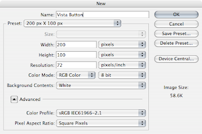
The first step is to create your canvas. It can be any size you want you button to be. I've picked 200pixels by 100 pixels. Mine, of course, will be rectangular.
In hindsight it would be better to fill the entire canvas with your gradient we are about to create. I don't no why but I decided to create a rectangle in the middle of my work piece. I would suggest you skip this step.
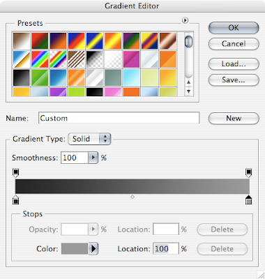
The gradient that is used is comprised of two colours. The one on the left is colour value, 252525. The colour on the right is 9a9a9a. Put these colours into into the gradient panel.
The gradient has a definite start and stop. Click in the centre of the bar to add a colour value. Move the small diamond as close as you can to the centre. You gradient style should look something like this.
Apply this to your canvas. Keep the application line vertical and you should have a cool gradient.
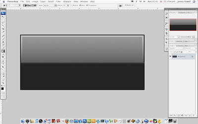
The next step is to add some small features to the canvas (I've cropped my canvas now). Select the whole work piece. Go Select > Modify > Contract and enter 1 pixel. This should shrink you select. Now you need to inverse the selection so you are not selecting the middle of your work. This is easily done. Go Select > Inverse. Now colour this new selection with the colour value 252525. You work should now look something like this.
The next step is to create a very faint white to transparent gradient on the edge of the lighter part of your work. First using the marque tool select the top half of your work but don't select the back board you just created.
You are going to use one of the fancy selection tools. These don't get used often are are selectable in the top left tool bar when you have the select tool open. Press the third button from the left. This is the "Subtract from Selection" tool. Which as you might have guessed enable us to remove a part of the selection.
You now need to select a rectangle inside your previously selected area. Using the space bar to move any selection you have draw a box with a 1 pixel boarder. It doesn't have to be to accurate, just very small and equal on all sides. Let go of the mouse when you have an area selected that you are happy with.
Use the gradient tool and select a white to transparent selection. One thing to note, change the opacity of the selection down. I had a good effect with 44% opacity. Fiddle about. Drag the selection down from the top. Press control + D to deselect the selection when you have done. If you don't like the effect press undo to have another go.
We are now going to apply another gradient, this time it will be at the bottom. Use the select tool again (and on a new layer if you prefer) select and area that is on pixel high but does no go into the board we created. Have a look at the image below, if you don't no what I mean. If you want you can create these on new layers if you want to fine tune the design at a later stage.
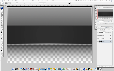
One last thing to do is to create a reflective shadow that is all the rage these days. Select the layers you have (I have 3) and drag them on to the new layer button at the bottom of the layers palette. With these 3 layers still selected go Layer > Merge layers.
The next step is to rotate the image. Use the magic wand to delete any white areas on your canvas. Then transform the layer. Press Control + T or Edit > Free Transform. Right click on the layer and select flip vertical. Move the layer so it is underneath.
We are now going to add a layer mask. A layer mask enables us to removes parts of the image, but still have them for later use. This also enables a graduated removal of the image. To create a layer mask go Layer > Layer Mask > Reveal All. Use the black to white gradient and apply this gradient. You want the image to be shown at the top of the gradient but disappear at the bottom. This is white to black change the opacity further using the slider in the layers palette.
Your button is now all but done. Add some text, I recommend Veranda, and save your image out. You now have a Vista looking button for use in any application.![]()
I hope this tutorial was interesting for you. Please leave a comment.


15 comments:
Great article bro, I think this wil help me to designing new style buttons
Thanks, hope you like it.
I really like it thanks James.
man, I just can't get it... when do you create the layers...? suddenly you have 3 layers... You lost me at Select > Modify > Contract. The Contract feature in not available... should I have created a new layer some time in between?
Sorry, the layers can be created for the gradients, I \'ll go back and explain this better.
The select > modify > Contract is only available in CS3 i think.
it is availabe in CS2 also, but at that point, with the steps described, I cannot access the feature...
10x so much for your time.
The contract tool is available in all versions of photoshop, right down to PS 6.0
It may not be active for you for a number of reasons:
a) you haven't selected anything [ctrl + a to select everything]
b) you are working on a locked layer, and therefore there is nothing to select
[to fix:
Open layer properties by right clicking the background layer, and the just click ok. The little lock on the layer should have disappeared.
Alternatively, start this step on a new layer which will be directly editable. Select all by ctrl + a and you should be right to contract the selection]
You will be able to use the contract tool now.
: )
Thanks for the info jamesshendo
HI
I did this on Photoshop Elements 5.0, works great :) Again for me the contract button was greyed out, so i skipped that bit and selected it but smaller box :) works gr8 ty j
Awesome send a link to what they look like. Well done.
nice button, i do exactly the same for my site, thx
For those of you that are having a problem with the "Select > Modify > Contract " portion of this tutorial, here's the solution:
The contract function in PS 7.0 and other older versions are disabled at the point (irritating too!) you want to use it, so you have to go around it. Pretty simple. Just Select All [Ctrl+A] (Select » Select All)
Move the selection down one pixel and right one pixel (using the arrow keys next to the keypad)
Contract (Select » Modify » Contract) the selection by one pixel
Move the selection up and left one pixel. You should now have a selection which is one pixel away from the canvas edge on all sides
Contract (Select » Modify » Contract) the selection by one less than the amount you originally required. This should help you.
Thanks thats a create tip.
Instead of using contract and then later making that fade border box, you could just use Select > Modify > Border.
Great Tutorial!!! Thanx Very Much! ^^
Congratulations!
Post a Comment