Great Design

Welcome to Great Design. This website will look at the best designs on the internet. As well as tutorials teaching you how to produce amazing designs and get good looking results.

Creating An Abstract Gaming Signature

Oct 31, 2007

Hey

This is going to be a quick Photoshop tutorial demonstrating how to create an Abstract gaming signature. This can be used with any type of game. I've used the new Crysis game, but this can be done with any genre. I recommend a first person shooter, or similar as this kind of signature blends in well. Click on any of the image to enlarge.

For this tutorial you will need:

Photoshop or Similar
A grunge brush pack (provided below)
A suitable image (also provided)
A cool font (provided as well)
About 10 - 20 minutes.

Step 1) The first step is to prepare your canvas. This can of course be any size. If a forum limits the size of an image to 200 x 50 pixels use a canvas that is 200 x 50 pixels. I'm going for a canvas about 500 x 150. This gives me plenty of space to work with. When your canvas loads set the background layer to a normal layer by double clicking on it and selecting "Ok" when prompted.

Step 2) On the base layer set a gradient of White to Black.


Step 3) Create a new layer. Use the gradient overlay function to set the gradient from Black to Transparent. Make sure the reversed option is selected to get the black to the bottom. In the blending mode options select the blending mode of the layer to Screen.

Step 4) Grab some abstract brushes. I recommend this one from deviant art, or Google abstract brush for some inspiration. Set the brush colour to black and apply some brush strokes to the page. Just click in some random places with different brushes.


Step 5) Create a new layer. Set the brush colour to white. Apply the same effect again to the new layer.


Step 6) This step is to add in your image. I've chosen the Crysis image. My original was found here. I've cropped and removed the background.


Place the image so it has good layout on the page. Corners are always very good options.


Step 7) The next step is to apply and effect to blend the image into the background. Since the image is dark and uses the black, grey and white colours i've chosen the Multiply option. This produces a very scratch effect as the layers underneath are shown through. One other good way to improve the image is add a layer mask and and use a black to white gradient to remove parts of the image gradually. I've done this on the bottom of the image.


Step 8) The final step is to add some text. I've used Kremlin. I've coloured the text black and reduced the opacity. Save this image out. You now have a cool abstract forum signature which you can use. Personally I am very pleased with the out come of this image. Click for the full version.


Please leave a comment with your creations and any further ideas.

Prague Panoramas Pictures

Oct 29, 2007

Hey Peeps

On my recent trip to Prague I took many photos as you do. One of my favourite kind are Panoramas I love taking them and stitching them together in Photoshop. Below are the couple of Panoramas that I took. The first image contains 9 seperate shots and hasn't come out that well to be honest. Quiet a lot of data had to be removed since they were taken in a big curve. At one point there was more white that actual colour. I've 'shopped in a couple of trees and areas to make it look better. Thank fully the other 3 were taken with less shots and have come out a bit better.

Click the images for the full versions.


I'm Back

Oct 26, 2007

Hey There

This is just a quick post to say that I have returned from Prague. It was great. I'm going to, in the next couple of days, have some more tutorials and pictures from my trip.

Sight tight and I will be back soon.

Going Away For 4 Days

Oct 21, 2007

Hey

This is just a quick post to say that I am not going to be hear for the next couple of days, I am going away to prague for a short trip. I'll take lots of photos, and share the best ones with you. Don't be to lonely while I am away.

See you soon.

Creating A Lens Flare With The Wordpress Logo- Photoshop

Oct 20, 2007

Hey

I was busy stumbling across the internet and I came across this site. Called Word Press Customization its a well design site, about creating Wordpress theme blogs.Creating A Lens Flare With The Wordpress Logo Anyway, the header particularly struck me as something that would be easy to recreate in Photoshop. This tutorial can be applied to nearly any logo. But i'm gonna try and match the original, I wanted something to aim for. The image on the right is the cropped version of what the final piece should look like. Click any of the image to enlarge.

For this tutorial you will need:

Photoshop
Wordpress logo

Step 1) The first step is to create the canvas and download the Wordpress logo. Click the image below for the full size. You need to create your canvas as large as you want it. I recommend around 1600 pixel x 800 pixels high. The larger the better. Set the colour to black.

Creating A Lens Flare With The Wordpress Logo
Step 2) Place the logo in the centre of the page on a new layer. You don't want the logo to be overly large, but then again don't make it tiny.

Creating A Lens Flare With The Wordpress Logo
Step 3) The next step is to start creating the effects. Duplicate the logo layer. Merge this layer with the black background layer (Layer > Merge Layers). This merging of the layers will be used to help create the lens flare. The next step is to use the lens flare function. Go to Filter > Render > Lens Flare and set the options to 105mm Movie Prime, and about 70-100%. Change these values depending on how your image looks. Click Ok when you are done.

Creating A Lens Flare With The Wordpress Logo
Step 4) Create a new layer above the background layer, but below the logo layer. Using the eye dropper tool (I) select a light blue colour from the logo. Using the colour fill the new layer you have just created. Set the layer blend mode to colour. The white lens flare you have just create should now be a cool blue colour. Adjust the opactiy of the new layer if needed.

Creating A Lens Flare With The Wordpress Logo
Step 5) The next step is to apply some lighting behind the logo. Duplicate the logo layer. You can at this point place it behind the logo or wait till the end of this step. With this new layer go to Image > Adjustments > Brightness/Contrast and set the brightness to full.

The next step is to blur out the layer. Go to Filter > Blue > Gaussian Blur and blur out the image. I've chosen a value of 30. You may need to change this depending on the size of your image.

Creating A Lens Flare With The Wordpress Logo
Step 6) Set the blend mode of the layer to Hard Light, duplicate this layer and change this blending mode to Overlay. This will create a subtle light around the logo.

Creating A Lens Flare With The Wordpress Logo
The logo now shines. Since the white shine was created with the logo it doesn't look to fake, since the original logo was used.

Creating A Lens Flare With The Wordpress Logo
Step 7) You could at this point finish. Since the image does look good. But I want mine to match the one I have found.

The next step is to add a streak of white. Create a new layer underneath the logo (mine is shown ontop) and add a white streak with a soft brush. It wants to be around 30 - 40 pixels. Make a nice simple sweeping action around the bottom. Apply, again, a Gaussian Blue of about 5. To blur this out. Set the mode to Overlay.

Creating A Lens Flare With The Wordpress Logo
Step 8) Duplicate this layer you have just created, and smash Cmd + F (Ctrl + F on Windows) half a dozen times, this is to reapply the blur. Change this layer blend mode to soft light (seeing a pattern with the blending modes?)

Creating A Lens Flare With The Wordpress LogoStep 9) Duplicate the last layer again, and remove the blending mode. Reduce the opacity. This can be an optional step, since my white flare looked a little to blue.

Step 10) One of the features of this logo lens flare is the small circles. This "traditionally" looks like a lens flare. It is easier at this stage to create one manually using the brush options in Photoshop.

To create the brush style find a hard brush about 20 pixels in size. Open up the Brush Dialog Box (F5 Window > Brushes). In the Shape Dynamics box change the jitter to 100%. This will make the brush strokes move about.

Creating A Lens Flare With The Wordpress Logo
Next in the Scattering section change the scatter to about 600% and the Count Jitter upto 100%. This will move the placement of the brushes strokes around on the x and y axis.

Creating A Lens Flare With The Wordpress Logo
Step 11) Using a yellow/orange colour apply a small amount of jitter on a new layer. Do not over do this. It wants to be a subtle as possible. Do the same with a blue colour.

Creating A Lens Flare With The Wordpress Logo
Step 12) On these new layers (I have 2) change the blending options to screen to reduce the amount they are visible by. It is a good idea at this point to erase and re-do any parts you don't like. As well as this experiment this the Gaussian Blur in blurring out the parts.

Creating A Lens Flare With The Wordpress Logo
Step 13) The next step is to add a swoosh at the bottom of the logo. On a new layer again use the Circular Marquee tool to create a circle on this layer. It doesn't have to be perfect. Then go to Edit > Stroke and set the stroke to 3-4px depending on how it looks. If it is to big/small undo and change the size. Change the colour to white.

Creating A Lens Flare With The Wordpress Logo
You should have something like this.

Creating A Lens Flare With The Wordpress Logo
Step 14) De-select the Marquee (Cmd/Ctrl + D). With the Swoosh layer still selected go Filter > Distort > Twirl. Twirl this layer. At this point it doesn't matter how you twirl it. I wouldn't recommend doing it to much. If you don't like what has been achieved undo and re-apply the filter. When you have a nice twirl, remove with the eraser the top part. Move (V) is necessary to a new part of the canvas.

Creating A Lens Flare With The Wordpress Logo
Step 15) Set the Blend Mode to Overlay and repeat the twirl if necessary.

Step 16) Crop into a letter box shape and save out. You can click the image below for the full version.

Creating A Lens Flare With The Wordpress Logo
I hope you liked this tutorial, it can be applied to nearly any logo. Please leave a comment.

Creating A 3D Polaroid - Photoshop

Oct 19, 2007

Hey

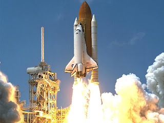
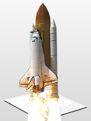
After surfing the internet, as I do, I cam across a cool idea on how to 
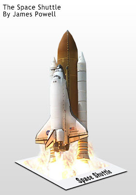
make an image jump out of a Polaroid. Its an interesting effect and looks great when completed. Its a long tutorial and will take some time to complete. We are trying to achieve and effect similar to the image on the right.

For this tutorial you will need:

Photoshop or similar
The Space Shuttle Photo (Included)
About 45 - 1 hour

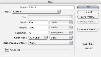
Step 1) The first step is to create your canvas. I always chose a size that is larger than I will eventually need it. Have a size of about 800 pixels by 1200 pixels. The size can always be cropped later.


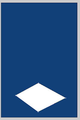
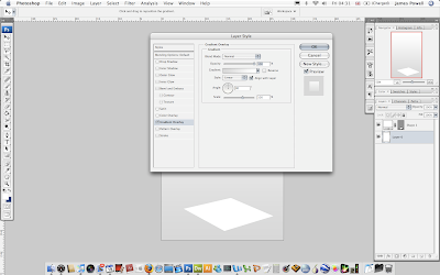
Step 2) The first step is to make the basic polaroid. Change the background layer, which at this point is named "Background". Double click it and press ok when the dialog box comes up. Change the layer to any colour other than white. I've randomly chosen blue.

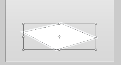
The next step is to create a new layer. Select the Pen tool, and roughly draw the following shape onto the canvas by clicking 3 times in the appropriate places and once more on the starting point. Colour it white in the layers palette.


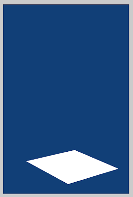
Step 3) This step is to find tune the layer to look like a flat polaroid. Use the white tipped selection tool (Shift + A) or hold command on the mac (I think it's Alt on Windows) and move the points so your shape resembles something like the image below. Take you time, you want this to look as good as possible.


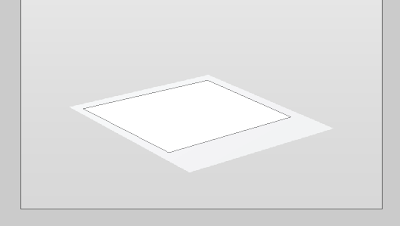
Step 4) We now have our basic shape, we need to add colour. Select the background layer (mines coloured blue), double click it to bring up the properties box. Select the Gradient Overlay box. Change the gradient so the darkest colour is a lightish grey. Align the gradient so the darkest part is at the bottom. Refer to the image below if you are stuck.


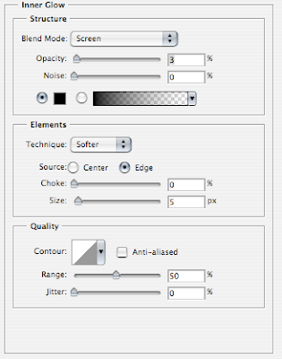
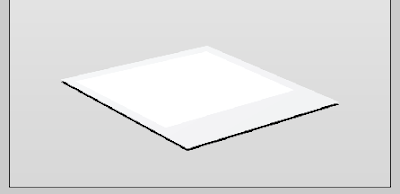
Step 5) Now we have a different coloured background, we can change the colour of the polaroid. We need to darken the colour of the white square, because we are adding a white layer in one of the next steps.

Double click the polaroid layer and select inner glow. Change the colour to black and reduce all of the values as shown in the image. This is very subtle which is the effect we are aiming for.


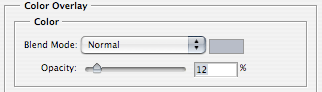
Select Colour Overlay. The gradient over layer is the main way to change the colour of the image. Pick a grey that isn't to dark, but isn't to light. Set the opacity all the way down.


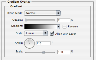
The final step is to add a Gradient Overlay. This will create a gradient over the top of the image. Reduce the opacity of the gradient all the way down. Line up the gradient so the darkest part is on the left hand side of the polaroid as we look at it. Its about 110-120 degrees.

Click apply when you are done.


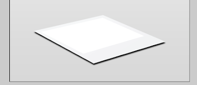
Step 6) The next step is to add a white area where the action of the photo will happen. In the image below you can notice the effect we have applied in the previous step.

Duplicate the layer, by dragging and dropping the layer onto the layer icon in the layer pallet. Right click on the layer and select clear layer style to remove the style. The next step is to reduce the layer. Press Command + T (Ctrl + T) or Edit > Free Transform and move the edges in ever so slightly. About 10%.


Step 7) Use the white pen tool (Shift + A) or Command click (Alt + Click) on the points and move them up the polaroid. Adjust the points until the layer looks like this.


Step 8) Duplicate the first polaroid layer and remove the styling again by right clicking. Change the colour to black and move the layer down. You want a clear edge, to be used as a shadow. Right click on the layer and select rasterize layer.


Step 9) With the Black layer still selected go Filter > Blur > Gaussian Blur. Set the value to about 2.5. This will blue the black layer and create a shadow.


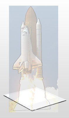
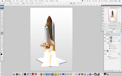
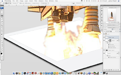
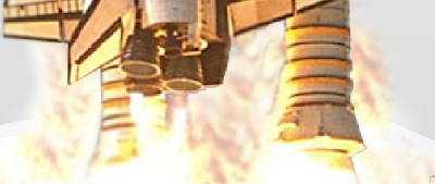
Step 10) The next step is to add the 3D / Action part of the image to the polaroid. You can pick any image, there just needs to be something happing and moving upwards. Click the image below to use the full size. This image was found here.


Step 11) Use the pen tool again, but set the selection to paths, instead of shape. This can be done in the top left corner of the tool bar. This will stop a coloured shape being create and only a path.


Step 12) Insert the image you have chosen. I've cropped mine before inserting it. Reduce the opacity. Draw around the Space Shuttle and some of the exhaust. It doesn't need to be 100% perfect but you shouldn't go into the actual shuttle itself.


Step 13) We now need to work with this path. Use the Path pallet (Windows > Paths), and select the path. Right click on the path and select "Make Selection". This will change the path into a selection. Go to Select > Inverse. This will select everything but the Shuttle. Press delete to remove the sky.


Step 14) Using the eraser, go around the edges and remove any pixels that shouldn't be there. Try at this point to be as precise as possible. Blur the brush tip (Shift + [ ) if it helps.


Step 15) Use the blur tool lightly on the edges to remove the harshness created by deleting the pixels. The edge shouldn't be blurred to much.


Step 16) Reposition the image as necessary. If I was to do this again, I would put the image slightly higher up.


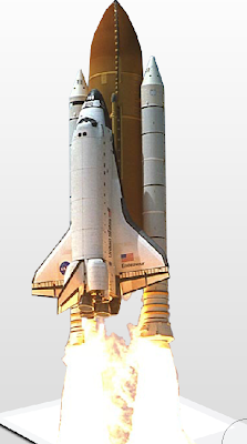
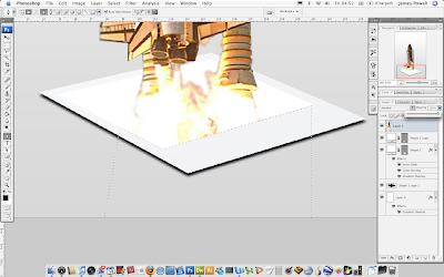
Step 17) We now need to square off the exhaust. Reduce the opactiy of the shuttle again and draw a path along the lines of the white area in the polaroid, include any of the excess thrust. Once again, go to the paths palette, make the path into the selection and press delete. You should end up with something like this.


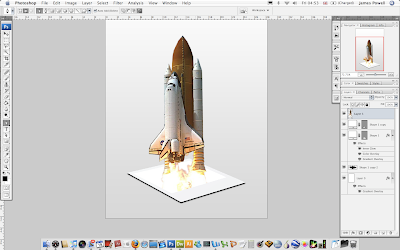
An overall look at the image we have so far.


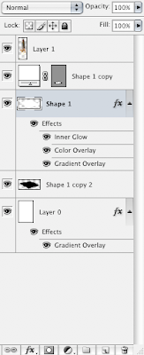
You palette menu should look something like this. It doesn't matter too much if it doesn't. I try to work on as many layers as possible.


Step 18) At this point it would look good it the white part of the polaroid had some thrust added. Create a new layer. On the white layer of the polaroid, use the magic want to select the white area. Move back now to the layer we have just created.


Step 19) Use the clone tool and add some thrust to the white area. When you have completed this, deselect the selection and add some thrust to the sides of the booster rockets. The selection is so there is a hard edge around the sides of the polaroid.


Step 20) Add some text (I've used Marker Felt) if you wish and use the transform options to move it into a good position. You may need to rasterize this. Save and export as .jpg and you are done.


Please leave a comment, with you creations.