Great Design

Welcome to Great Design. This website will look at the best designs on the internet. As well as tutorials teaching you how to produce amazing designs and get good looking results.

The Use of Brushes In Illustrator

Nov 30, 2007

Hey

There are three main types of drawing tools withing Illustrator. The pen (and subsequently shapes), and pencil and finally the brush. I've commonly used the pen and pencil for drawing shapes. Both have there advantages. But what about the third option the Brush. The brush is a little different as you have to make or install a brush shape. You can then use this brush for more complex effects. This will be a quick demo and information about the brush. Its not a tutorial in its self but still very useful.

Step 1) The first step in creating a brush is to have what you want for a brush drawn on your art board. This is a super simple example but it can be applied to nearly anything.

Below i've drawn a couple of illustrator paths using the pen tool.


Step 2) The next step is to pick the type of brush you want to make. Open up the brush palette Window > Brushes press the new brush at the bottom of the palette, select new art brush. You can of course experiment with these values.


Step 3) (Image missing because i'm a forgetful noob). Name your brush, and press ok. You now have your brush.

Step 4) Use your brush, drag along the art board to make your design. Its as easy as that.


You can of course be very complicated (or simple) with your brush.


Things to consider. Not all of the sources you use to create your brush (step 1) will work. You need to experiment. Change the settings about try different types of brushes and different sources.
As well as this if you want to save your brush out you need to select the brush libraries menu (most left button in the brushes palette) and save it out. If you don't do this your brush will only be availble with that piece of work if you don't.

If you want to check out a cool use of brush within Illustrator check out this post by Blog Spoon Graphics. It is a simple design to create a map, but shows you the principles (this post was going to be longer but i'm short on time. I'm going to be using brushes more and more in my designs that I will share with you. One of my favorites is going to be this sites redesign. It is coming a long and it is going to be sweet. I've got plenty of cool ideas.

Stay Tuned.

Feed Troubles

Nov 29, 2007

Hey

This is just quick update about the RSS feed. At the moment i've changed it over to Feedburner so I can have all the advance statistics. Currently blogger doesn't let me have this opportunity so I decided to change. As a result its screwed a couple of things over and its not updating fully at the moment and a couple of other problems that need to be worked out.

Currently i've changed the post feed to short for the time being so a couple of things might look a little screwed up. I'm sorry, I will be changing it back in the next couple of days when it gets sorted. In the mean time you can always check back at the home page. http://great-design.blogspot.com for the latests posts.

I will give another update when i've sorted the feed business out. Hopefully in the next couple of days I will have a site design away from the default scheme. I've got all of the layout planned i'm in the process of implementing it on my test blog. Stay tuned because it will be awesome.

Creating A Grungy RSS Icon - Photoshop

Nov 28, 2007

Hey

This is a very simple tutorial that is going to turn an RSS icon into a grungy version that can ideally be used on a website. You can apply this technique to any image. Its really easy to complete. Click any of the images for the full versions.

For this tutorial you will need:

Photoshop
A grunge Black and White Image (provided below)
A good grunge brush (here)
The RSS icon

Step 1) Pretty Simple this step, download the RSS icon and save it to your hard disk. You can click on it for the full version.

Step 2) Open the RSS icon in Photoshop or similar. Since it is a png it should have some transparent edges. This should be on a seperate layer. If it is placed on the background layer double click it and select ok when prompted.


Step 3) To make the icon look more grungy you need to change the colours to suit. I've change the hue to +16, lowered the saturation and lightness to -63 and -39 respectively. Change these values to any you want.


Step 4) To enable some of the layer blending styles later on remove the white bits within the icon. Select the magic wand tool click the white areas and press delete.


Step 5) The next step is to add the first layer of grunge. Download the black and white image below (click for full size) and place in into your document. Go File > Place. Right click on the file and select rasterize.


Step 6) Select the magic want again. One the new black and white grunge layer select the white and delete it. Change the blending option to Soft Light. The blending option blends the layers together.


Step 7) This is step involves removing some of the black and white of the image. On the original RSS icon select the areas that are transparent. De-select Contiguous from the tool bar at the top of the screen to select all of the areas that have no pixels.

Select the black and white layer with the areas still selected and press delete.


Step 8) The worn out look is achieve very simply. Download and load in the grunge brush (Edit > Preset Manager > Brushes > Load).

Go Layer > Layer Mask > Reveal All. Set the grunge brush to black and in the layer mask apply some grunge brush strokes. Set the opactiy of the brush down so you don't delete a lot at a time. Use the Brush Options (Window > Brushes > Brush Tip Shape) to change the angle of the brush to best suit your needs.

A layer mask is used instead of the eraser because you still preserve the image data and this can be recovered easily by removing the layer mask.


Step 9) Apply some of step 8 and 9 to your image. The result you get looks something like the image below. I'm pleased about it and would look brilliant on a grungy type website.

Click for the full image.


Please leave a comment with links to your creations and if you applied it to your site please drop a comment so I can see what it looks like.

How To Use Bought or Downloaded Vector Files

Nov 26, 2007

Hey

A couple of days ago I mentioned how you use downloaded vector files. For a new user into buying and user vector files this can be an "interesting" experience. I am going to show you what you get and how to effectively use them.

I am going to use an example from Go Media. They are great vectors and from my stats I can see that many of you have bought them. I hope you enjoy your purchases. Anyway if you head over to the free section you can download a sample file. This is the one I will be using for the mini tutorial.

What you get when you download the file is a .eps file. This is a file that can be read and wrote to from all vector packages (even photoshop can do it). Its not application specific so you shouldn't be tied down, unless you have a really old software. Each of the sets you buy will have a seperate file named appropriately.


When you open the file you get all of your vectors. My version of illustrator comes up with a text warning, usually you can skip the warnings because what you want is the vectors and not the fancy text.

The vectors you buy will come a bit like this. Each one is placed on the sheet read for you to use.


Using the vectors is quite simple. You simply select the one you want with the selection tool (Black arrow (V)) and copy to the clipboard. There is no need to place the file in a special folder or configure you software to read the file in any way. You just get the vector you want and you can be on your way. Super simple.


Some general tips.

Save a back up of the file. Always do this. Some sites only let you download the vector file once, may be twice. If you don't have a backup and you delete the vector off the file you are screwed.

If possible set the file to read only. This can usually be done by right clicking. Enabling read only is similar to having a backup, you are less likely to change it.

All in all vector files which you download are very simple to use. They are read to be used and can be applied straight away.

If you have any comments, problems, tips or tricks please leave a comment below.

Creating A B & W Image With Coloured Areas

Nov 23, 2007

Hey

This is a rather simple tutorial that can turn any coloured image into a black and white image with a strip of highlighted colour. It doesn't take long to complete and you will wonder why you haven't thought of this before. For this tutorial you will need Photoshop (or similar) and a colour image with a highlighted area.

Step 1) The basic idea behind this technique is to use the history brush to reverse the black and white state that we will apply. Depending on you settings you will need to change the history states within the preferences. Open up the preferences menu Cmd/Ctrl + K and selection the performance tab.

On the right you should see history states. Depending you your skill with the mouse you will need to change the amount of states. I recommend 20-40. To many and your memory will be filled up very quickly. To little and you will run into the chance of running out of states.


Step 2) Load up the History Palette. This can be accessed from Window > History.

Step 3) Load your image. I'm using a train i've found on Wikipedia. Ideally I wanted to use a image of a person in a busy street standing on there own. I couldn't find one so you are going to have to stick with a train instead. Click the image below for the full sized version.


Step 4) Go to Image > Adjustments > Black and White. You can fiddle around with the values but I just press ok. This will turn your image black and white.


Step 5) This is where the history brush comes in. Using the history palette select the original image from the left hand side. As shown below.


Step 6) Then using the history brush from the palette (Y) brush over the areas you want to be re-coloured. If you go out of the lines it doesn't matter. This is resolved in the next step. Make sure the mode is set to normal.


Step 7) If you have gone over the areas you want to stay black and white it is very easy to correct. All you have to do is change where the history brush is being used from. At the moment it is taking the data from the original image. But if you set the little icon to the Black and White option has appeared you colour over black and white back into the image. Really simple.


Step 8) Save out your image and you are done. I have included some extras examples. Click the images for the full sizes.


Its a really simple and cool effect. I like it. Post your links to your image and lets see what you have come up with.

Go Media's Arsenal Of Amazing Vectors

Nov 22, 2007

Hey

I like to use Vectors a lot. They offer superb quality. You don't, like with many stock images, get rough lines or pixelated edges. As a result they can be scaled and used for virtually anything. This post today is going to be about a vector site which offers fantastic quality vectors for extremely cheap prices. Call Go Media's Aresnal they hold some of the best vectors around. I'm going to go through some of the packs today in this post, and show you what you can get. You will be amazed.

The Sets

Go Media has divided the vector arsenal they hold into 8 outstanding sets. Each set contains 7 or 8 smaller packs (these can be downloaded individually). The prices range from $15 for the individual sets and $50 for a complete set. You can pay over $350 for every single vector they own. There is a couple of thousand for every single one.

Whats In The Sets?

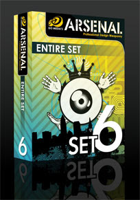
Each big set is split into small subsections which contain a vector file with all of the individual shapes and vectors contained on it. I will take set 6 as an example of what is included.

If you decided to buy vector pack 6 you get a downloaded zip file of 16mb. In this file there are 7 eps files. Eps files are a standard export of Vector files, they contain all of the information which can be used in Illustrator or any other vector program. Even Photoshop can handle them.

Each of the 7 files contain all of the individual vectors which you can copy and paste to your your work. Each of the 7 .eps files is on a different theme. You can buy each of these theme packs separately but you don't get the multi buy discount.

Contents

As I am focusing in on set 6 I will show you the specific contents of the vector set. All of the other sets are similar, they just contain different vectors. Set 6 contains:

Line Work

If you have every tried to make very detailed lines within Illustrator you may find that it becomes difficult. Problems usually arise trying to get all the lines perfectly lines up. Save your self some work.


Radial

Very similar once again to the lines these are fantastically detailed spirals and circles. They make great backgrounds.


Heraldry

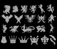
Anyone wanting to do something medieval or wants to simply use dragons, lions, eagles, crowns, feathers, etc. This is an amazing pack that has a lot of detail. The only down side is they do lack in number. You only get 22 compared to the other packs which contain a lot more.
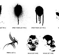
Destroy 2

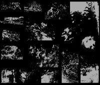
As the packs are designed to follow on from previous installments this is the second type of pack with the in a similar nature. I would personally have named this grunge, as it is very grungy, dirty and distressed. Used best for overlaying on art work. They add cool texture. A very versatile pack.

Skylines

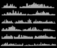
Ever need a skyline to set off that city background? This pack is probably what you need. Based on New York City, Cleveland, San Diego, Atlanta, Boston, Philadelphia, Houston, Dallas, Detroit, Chicago, Los Angeles, Minneapolis, and Miami (although I can tell the difference) they add a fantastic skyline feel to any piece of work.

Scribbles

Surprising difficult to make. The scribbles pack is just that, scribbles. The .eps packed with over 50 different scribbles can be used for nearly anything. Although they may not seem useful they can be used for nearly anything. They contain a nix of grunge and illustration you can find many uses for them.

Anatomy

Probably the most detailed of any set this set is all about the anatomy of a human. It contains vectors on spines, bones, hands, feet, heads. All sorts. If you need a piece of human to set of a piece of work. This vector pack is definitely the one you want.

How They Come

So you have download the vector pack and you have parted with your money but how to they come? Each and very one of the vectors will be on a vector file. You can then pick the one you want copy it to your clipboard and use it as you please. I will be doing a more detailed post on how to use vector packs in the future.


Want Some Free?

No site would be anything if you couldn't sample there offerings. If you want to download a sample vector file, similar to the one above head over to the Freebies section. They have a free vector pack which contains a small sample from every single pack. Really useful as you can see the level of detail they contain.

Conclusion

Go Media's Vector packs are definitely the best ones around. They offer a superb quality for a very cheap price. I would urge you drop buy and check out there products before even considering looking anywhere else.

A Good Place For Design Tutorials

Nov 20, 2007

Hey There

One thing that I like to do in my spare time on the internet is find and do Photoshop tutorials by other people on the internet. One of the best places i've found is Good Tutorials.


This site is a collection of user submitted tutorials, that are some of the best around. Each tutorial which is submitted goes through a moderation stage of 5-7 members. As a result each tutorial is top quality and you don't get the spam ones falling through. I really like it. Many of my tutorials can be found on the site. So check it out.

How To Perfectly Remove A Colour From A Black and White Image

Nov 18, 2007

Hey There

This is a rather simple trick which you can use to remove a colour quickly and easily from a layer within Photoshop. The idea behind this is that you have a black and white (or grey scale) image, where you want to remove either the black or white from an image.

For example say you have an image similar to the one below and you want to remove the white areas.


Normally you would use the magic wand to select the white areas and press delete. You end up with a slight white/grey boarder. You could spend edges fiddling around with the tolerance. But there is a very simple way.


If instead of using the magic want you change the blending options look at the results.


What I have done is change the layer blending option to Multiply. Simply put this removes all of the white from the image but it keeps nice smooth edges. As a result you get very clean edges quickly and simply.

On the other hand if you want to remove the black from an image set the blending option to Screen. This removes the black but keeps the white.

This is a simple but easy to do technique that helps remove anything from an image. I hope it helps.

The General Stuff - Re-Design ?

Nov 16, 2007

Hey There

This post is more of an update than anything else. Currently we are growing in visitor numbers. This is great, I always like more visitors, although usually more visitors are harder to please. If anybody does have a comment please leave a post, I usually always respond to them.

Re-Design?

I've been thinking. I've had this blog now for a couple of months and its turned out to be a success in my mind. But I am currently a bit bored of the graphic layout. At the moment it is one of the default styles for blogger. When I chose the design I didn't have much experience in blogger or website design. This has changed. As a result I want to make a better and more professional looking site. As a result slowly over the next coming weeks I am going to redesign the site to look better. It shouldn't be to major. I will still keep posting every other day (I have a good rhythm now).

If you have any design ideas, please leave a comment.

Creating A Colourful Movie Style Poster In Photoshop

Nov 14, 2007

Hey There

I wanted to create a very colourful and different poster in Photoshop (I want to say 60's era but i'm not quite sure). I've tried to make this as easy as possible to do and doesn't require much skill. Through out this tutorial I have used two shape packs that I have purchased off the internet. I'll offer an alternative when I get to the required stage.

The aim of this tutorial was to create something that is colourful, simple and vibrant. I'm advertising The Powell Blog in the poster but it can be used for nearly anything. It takes about 20 minutes to complete . For this tutorial you will need:

Photoshop
Lines Pack (Optional)
Star Pack (Optional)
Vintage Font (Optional)

All the images are clickable for there full sized versions, and remember subtly is the key the colours don't want to be in your face, they want to blend in nicely. Use pastel colour values and not the extremes (expect Black). If yours doesn't come out perfect it doesn't matter its all practice. If you are stuck please leave a comment and I will try and help. You can download the .PSD at the end.

Step 1) The first step is to create your canvas size. This in reality can be any size. I've chose for International Paper > A4. If you are only doing this for practice keep the size small or Photoshop will slow down.


Step 2) Once the canvas loads, select the gradient tool and create a new gradient. The colour values are #000000 for black, #0d5a76 for light blue and #3e9abb for dark blue. Notice the position there is more black and dark blue on the right, this will become the bottom.


Step 3) Drag the gradient from top to bottom to create the gradient background.


Step 4) The next step is to create some stars. Use the default star shape within the Shapes option (U). Use the colour value of #2e8eb8 for the stars. Add some small and big stars and at different angles. Place appropriately. When you have finished adding the shapes and if you have more than one star layer select all of the layers (minus the background) and merge them together (Layer > Merge Down Ctrl/Cmd + E). When you have done reduce the fill down to 35-40%.


Step 5) The next step involves a shape from the GraphicXtra's shapes page. I've used a star option, its available here for $10 / £7. If you don't want to spend you money then you can use the default one supplied this Photoshop, i'm sure if you searched the web you would be able to find one in a similar style.

The idea of the next steps is to add a star/flare background to the poster. The first step is to apply your shape. The colour value I have used is #022b4a.


Step 6) Use the marquee tool cut off the bottom of the shape. We don't need to have the bottom half. If the background is white on your layer, use the magic wand tool to select the white and press delete to get rid of it.


Step 7) Use the Move tool (V) and press Cmd/Ctrl + T to transform the layer. Stretch and position the layer so it covers the whole of the page. Line it up to the bottom


Step 8) Change the blending mode to Soft Light and reduce the fill to 65%. The below image is shown with what me have so far.


Step 9) This is where the Lines pack from GraphicXtras comes into play. There is one option which has loads of very small thin lines placed closely together apply this to the page (or more than one instance to the page). Use the colour value #0b5f8b.
If you don't want to purchase anything, you can use the rectangle tool to create a very thin rectangles down the page. Duplicate this as many times as you need to create an effect similar to the one below, it may take a while.
Merge the lines layers together into one layer before moving on.


Step 10) One the lines layer change the blending option to Multiply and the Fill all the way down to 15-17%. I like fill over opactiy, because it seems to create a more solid effect, compared to opacity which seems to wash everything out.


Step 11) Add your text. I've used Vintage from DaFonts. I've made all the text black, the styling will be done in the next step. Notice the main text in the middle isn't centered vertically, the off centre text just makes it look a bit different.


Step 12) Add the styling to the text. For the main text i've changed the colour overlay to a deep red, a thick dark blue stroke used previously, and an inner glow with no range. Change these value amounts to suit the amount and size of your text.
The small text is an off white/beige colour with a small dark blue stroke. These values have been changed depending on the size of the text.

The final poster doesn't look half bad, I enjoyed making it and I hope you did to. Click for full size.


Please leave links in the comments with creations and thoughts. If you are interested you can find visit The Powell Blog any time. You can download the final .psd here.

Creating Pudsey Bear In Illustrator

Nov 12, 2007

Hey There

It is Children In Need on Friday, one of the biggest fund raising events in Britian, and I decided, to improve me Illustrator skills to copy the ever famous Pudsey Bear, my final version show right. This is the traditional Pudsey that has long been a favourite of mine. Not the new fangled one that the BBC is using the year. If you visit the Children In Need site you can view their new logo.

All this tutorial will use it he basic tools within Illustrator. It could take quite a while depending on you skills. But remember this. Even if it looks rubbish it is still good practice. All the images you see below are click able to see there full versions.

The plan is to draw the outline by hand using a fine stroke. Duplicate this layer, add the fill and then add the stroke. This is necessary since the logo has some open edges and this is the most simple way to do it.

Step 1) The first step is to create your canvas. I like a nice big canvas so chose a size that is suitable. Name and Save your work before you move on.


Step 2) Open up the Pudsey bear logo. I've used the one below as my starting point.


Step 3) Begin by drawing the head. Use the ellipse tool (l) to draw a circle with a 1 stroke. The using the Selection Tool (V) squash the head every so slightly be moving down the top point.

Step 4) Bring out the path tool by pressing P or using the icon. Draw and ear in the following shape. Over lap the edges ever so slightly. The edges will be removed in the next step.


Step 5) We are now going to use the Pathfinder menu. Open this from Window > Pathfinder. The path finder pallet enables you to join paths together into one complete path. Using this menu press the Add Shape Area (the furthers left). Then click expand. Make sure you have both paths selected.


Step 6) Repeat this step to draw the second ear. You can either draw it by hand, or undo, and copy and paste the first ear path. If you have copied and pasted, select the new path, right click > Transform > Reflect > Vertical.


Step 7) Moving on. Select the path tool again and draw the inner ear shape. Make sure the path is closed by clicking on the first path point when you have completed the shape. I reccommend doing the straight line first.


Step 8) Do this the right ear. You can, if you want, copy > paste > reflect.

Step 9) Step nine and ten becomes a little tricky. Use the path tool once again, to draw the scarf. Make sure you have included the small details in the bow. Go over the line around the head. Do no close this path, yet.


Step 10) To close the path, so it is easier to colour, first select the head shape. Copy and paste this onto the art board. You should have two copied. Align this new layer using the selection pointer (black arrow, V). In the pallet menu find the first head shape. It should be at the bottom. Click the empty space by the eye to lock the path, then click the eye to make it invisible.

With this new layer (it should look just like before). Select the path tool again and click very close, on the exiting path, to the scarf. This is to add another point. Do this on both sides. See the image below for an example. Then using the Direct Selection Tool (A) delete all the points until you end up with something that looks like the image below.

Ideally the points/ends should be closer together. Move the points about until they are very close and then join them together using the Object > Path > Join. Select the first option if prompted. If you are successful you should have a complete path for the headscarf.


Step 11) Make the head visible again and remove the lock.


Step 12) Add in an eye using the Ellipse tool once more. Use Selection Tool (V) to adjust the position and shape. Add an eyebrow (not shown below).


Step 13) Use the Polygon tool to draw the nose. Use the up and down keys to change the amount of sides before releasing the mouse. Draw in the the mouth using the path tool.


Step 14) Moving onto the body. Lock the head so you don't inadvertently make any changes. Use the ellipse tool once more to draw a circle and slightly squash it. I've done this on a new layer for ease of use later on.


Step 15) This is sot of two steps in one, because I forgot to take a picture when producing the tutorial. Using the pen tool once more, draw the rough shape of the legs. Follow the original image closely. This is mostly the side of the arms and legs. Notice the random bump that is present in the arms. Copy and paste this new path to the other side. Use the path finder tools to make this one whole path. Take your time. The more time take the better the image.

When you are done you should have a bear that looks like the below image.


Step 16) Draw in the rest of the arms with the path tool.


Step 17) Finish off the body with the two ellipses for the feet and the curve to mark his belly.


Step 18) Finish off the shape by drawing in the buttons. The shape is now done.


Step 19) We are now going to colour in the bear. Copy the layers (i've named them). Lock the top layers so they cannot be changed. Hide the top layers. These will be used later for the outline.


Step 20) With the bottom layers. Remove the stroke and add a fill. The colour I have used is RGB #FFE412.


Step 21) Do this for the rest of the body adding in the colour values as necessary. Remove by pressing delete the lines that are not needed. You should have an image that looks like this.


Step 22) A bit of detail at this stage. Add the white highlights to the layer using the ellipse tool.


Step 23) We now want to create a very thick outline. Lock and hide the coloured layers you have just been working on. Unlock and show the layers that will be used as the outline. Press Ctrl/Cmd + A to select all of the paths. Use the Stroke menu (Window > Stroke) to increase the thickness. Have it around 4-5px. Make sure all of the edges are rounded. If you want to get to the extra options click the arrow in the top right to show the extra options.


Step 24) Some parts of the image is removed. To achieve this it is quite simple. Select all of the paths again. Go to Object > Path > Outline Strokes. This will make all of the stoke fill paths. Make sure you have the thickness set correctly.

Then using the eraser tool (Shift + E) erase parts of the paths. These are at the following places in the image below. I've re-shown the fill layer.

Step 25) Looking good. Using the pen tool once again, have it set to the same stroke as the original outline and draw in the fur bits. I copied and pasted some of the paths to save time.


Step 26) Final steps to complete. Add in two more paths for the scarf. These come out of the edges like so.


Step 27) The final step is to add in the red dots. Use the ellipse tool again, with the fill set to red and draw in the circles. Copy and Paste to make sure they are the same size. Order the circles in the appropriate layer so they are underneath the lines. Use the eraser tool to remove the edges. It may be appropriate to lock some layers.

Admire your work. Looks very cool when done. The more time you take the better it will look, and more close to the original.


If you are stuck please leave a comment and I will try and help out. If you wish to donate some one to the Children In Need Fund, to help out Children who are in need (duh!) please visit this online order form to make your donation. Please leave me a comment if you do. Ill be donating later today (or on friday, when the show is one BBC 1).

VectorMagic. A Cool New Tool.

Nov 10, 2007

Hey

There is a really cool new tool out on the internet that can be used to help you vectorise any image. It produces really interesting and accurate results and is a lot better than the ones used by Illustrator. This new magical tool is called Vector Magic.

This online tool is designed to turn any inputted image into a vector image. Its very simple to use and the results can be retrieved off the server in under a couple of minutes. The engine works best with simple image with few colours. I've found that these result have come out the best. Photos which can also be upload, can be turned into vector but usually result in very jaggy edges between each of the paths.

There are only a couple of options to pick when uploading an image. Low, Medium and High. Low as the name suggests is done the quickest but produce the worst results. This isn't necessarily bad, if you want a quick starting point to work from. Medium and High do produce very accurate results. The high option usually results in hundreds of paths and shapes on your canvas. This can be useful if you want a very detailed image but is a pain if you want to edit your image afterwards.

Check it out see for yourself how it works. I'm sure you will be able to find a use for it. Vector Magic.

How To Create Number Stamps In Illustrator

Nov 8, 2007

Hey There

Every tutorial is usually followed by a step number to indicate how far through the tutorial a person is. These a very useful. But they are not very visual. This tutorial is designed to create a very visual grungy look for use on tutorials. I had an idea in mind for use on my personal blog The Powell Blog. I think there is a very unique style and I want use on these small thumbnails. You can use this tutorial with a similar design for your own site or application (such as a desktop publishing file). If you are ready lets begin.

Step 1)

The first step is, of course, to create your art board/canvas. At this point you can pick the size you want to use. I usually pick a size around 50px x 50 px (although I later upscaled this). One small tip, if you usually end up going over the size of the art board, as I usually do, make the size a little smaller. Of course you can usually re-size this later.


Step 3) The next step is to add your font. I've used the Bleeding Cowboys from DaFonts. I like the grungy appearance. Add this to your canvas and re-size it appropriately. I suggest you add this to the middle. Colour it black (or any colour you want). Lock this layer in the layer pallet ( Window > Layers).

Step 3) Most of the work will be done through the use of the pencil tool. Double click on the the pencil in the tool bar pallet on the right and change the preferences. I'm not 100% what fidelity does but a range of about 5 seems to produce good results. The less the amount of fidelity the more points the path will create. I don't want to many (20 fidelity will have the least amount of points).Smoothness generally increases how smooth corners will be. If you imagine a "V" a lot of smoothness will make this look like a "U" where as no smoothness will make look like a "V" (still got that?).

Next I want to create a shape that has some smoothness but still has some points.


Step 4)

The next step is to create a new layer. Place this below the text layer. For this grungy look use the pencil tool to create a shape that has some point but still some some areas. You want to make it look as good as possible. If you don't like it undo and try again. I suggest doing small areas and copying and paste this onto the art board.

One tip to remember, which is always good practice to do, is to close your paths. Press Cmd/Ctrl + J to automatically close the path.


Step 5)

One sort of "feature" of the grunge look is splatter. I've used the pencil tool again to create the small shapes. Take your time at this point. It took me about 20-30 minutes (I wasn't counting) to make all of the shapes. If you want to save time do some copy and pasting and use the transform tool (V) to help you change the shapes.


Step 6)

You can add extra layers of splatter as you want. I've chosen two layers of red using the same spatter layer.

Step 7)

The next step is to create another layer. This will be to use as another layer of splatter. I've chosen a darker green, as it matches in with the style of my website. I always like to have everything ordered into layers.


Step 8)

Using the pencil tool again, create another layer of splatter. For this step I create a small section with the pencil, adjusted the points as necessary. I then copied and pasted this section again and again but rotating it and scaling as necessary.

You want to make this look good. It doesn't have to be exactly like mine. Take your time and you should produce good results.


Step 9)

Export this using the File > Export function. The beauty of illustrator is that it gives good quality results, since it is all vector.

Step 10)

Change the number and repeat step 9 as many times as you want.

Below are the ones i've created and exported.


Please leave your comments and links to your creations.

The Importance Of Closed Paths In Illustrator

Nov 6, 2007

Hey

I'm starting to use Illustrator a lot and I have realized the importance of using a good technique when drawing my works of art onto the art board. One of the most important rules when using Illustrator is to close a path when you have finished using it. There are many reasons why this should be done, which I will explain below.

Although when you fill a path the fill takes the shape as you may want, as shown below. It does begin to look messy. As well as this Illustrator has to guess what you want the shape to look like. This usually involves drawing an imaginary straight line. This is better explained by looking at the image below.
This also begins to pose problems when you begin to use some of the transformation tools. Since illustrator has to guess a lot many of the tools don't work. For example the Warp, Twirl, Puker, Bloat etc. The problem with this is that you may want to apply a transformation over a couple of objects. If one doesn't have all the paths closed, this will obviously not work.

Another reason to close paths is for external projects. By external projects I mean selling your work, giving it to others. Many people will want a piece of work to be complete and free of any errors. For example my favourite image stock site, iStock Photo wants all paths to be closed. This of course is for the above reasons.

Solving This Problem.

There are many ways to solve this little problem. The obvious way is to close the path. You can using the pen tool. This may be the simplest way. There are other ways such as making the path an outline, but usually you wont get a fill. If you want a fill but not a black line for example you could hide the line behind another fill. An alternate method is to copy the layer on top of the fill layer and apply a normal path and then change this to an outline.

It all sounds a little complicated but it is a lot easier if all your paths are closed.

Create A Blob Monster in Illustrator - The Scream

Nov 4, 2007

Hey There

Over that last couple of days i've been playing around in Illustrator a lot make some basic shapes and images. One of my best creations is the Blob Monster called the scream. It is really simple to do and doesn't take long to complete. This technique can be used for nearly any type of simple shape / monster. If you are ready lets begin. You can click any of the image for there full versions.

For this tutorial you will need:

Illustrator,
About 20 minutes.

Step 1) The first step in creating our blob monster is to create the body. Use the rounded rectangle tool to create a rectangle on the page. Use the arrow keys to change the amount of rounding being applied to the corners. Set the fill to nothing or white and the stroke to black. Have a stroke setting of around 2-3 pixels.

Create A Blob Monster in Illustrator - The Scream
Step 2) The next step is to create the sucker bit at the bottom. Draw an ellipse and position appropriately. Try to centre it as much as possible. We are then going to use the pathfinder tool ( Window > Pathfinder) to change the paths of the shape. Use the add shape area, and then click expand. This will remove the paths that are crossing and then join them together to make one path. The pathfinder is a really powerful tool and we will be using it a lot in this tutorial.

Create A Blob Monster in Illustrator - The Scream
Step 3) Use the ellipse tool again. Hold shift and draw to circles. Make them different sizes to make the mad appearance. Fill them black.
Create A Blob Monster in Illustrator - The Scream
Step 4) Use the rounded rectangle tool and draw a suitable shape to be used as the mouth. Set the stroke to black and the fill to white or nothing.

Create A Blob Monster in Illustrator - The ScreamStep 5) We now have the basic elements on the page. The next step is to fill the background colour of the blob in. Pick a green colour and set the fill of the shape to this colour.

Create A Blob Monster in Illustrator - The Scream
Step 6) We now need to apply some highlights. Copy the blob monsters layer shape. Set the fill to nothing and the stroke to a lighter green. In the stroke menu options (which can be accessed with the little arrow on the pallet) set the path to inside. Increase the stroke size.
The next step is to align the paths. Move (black arrow, v) the new path close to the main layer. Use the align (Window > Align) to align these paths. Use both of the horizontal and vertical alignments.
You way want to change the thickness of the black path and align these to the outside.
Create A Blob Monster in Illustrator - The Scream
Step 7) Repeat this process of copying the layer, changing the stroke settings and alignment for all the objects we have.

Create A Blob Monster in Illustrator - The Scream
Step 9) We now need to add some teeth. Use the rounded rectangle tool again to draw some teeth at the top of the mouth. You want about 4. Use Cmd/Ctrl plus the square brackets to move the draw shape up and down the layer list. You want them behind the highlight layer.
Select all of the top teeth, copy and paste them onto the canvas. Right click them them still selected select Transform > Reflect and select Horizontal when prompted. Press ok and manually align them behind the mouth.

The next step is to erase the bits of the tooth we do not want. Use the eraser tool (Shift + E) and use the square brackets keys to change the size of the brush head. Lock in the layers pallet (Window > Layers) you do not want to change. Press the little space by the eye to lock the layer. This will prevent editing.
Create A Blob Monster in Illustrator - The Scream
Step 10) Create another ellipse and use the square and pathfinder tool to get the top off the ellipse. Set the colour to pink, and the stroke to quite thick.

Create A Blob Monster in Illustrator - The Scream
Step 11) Copy the tongue layer, and as previously, add an inside stroke and change the colour. Align to the mouth.

Create A Blob Monster in Illustrator - The Scream
Step 12) We now need to make to visible that the blob is sticking up. Draw an ellipse again, and change its colour to the colour used to add a lighter edge (i've not done it in the photo).

Create A Blob Monster in Illustrator - The ScreamStep 13) Add another ellipse which is larger and use the path finder tool to cut these part away.

Create A Blob Monster in Illustrator - The Scream
Step 14) We are about half way done. Admire your work.

Create A Blob Monster in Illustrator - The Scream
Step 15) Use the ellipse tool once again, have the fill to black and draw and ellipse to create a shadow. Use the Cmd/Ctrl + Shift + [ to set the layer right to the bottom.

Create A Blob Monster in Illustrator - The Scream
Step 16) Add small white filled circles to highlight the eyes.

Create A Blob Monster in Illustrator - The Scream
Step 17) This step is a bit tricky so I have left it till the end (I also forgot to do it, shhh) Use the pen tool and draw a line around on the edge of the high light around the tooth. Set the colour to a light grey. Enable rounded edges.

Create A Blob Monster in Illustrator - The Scream
Step 18) Go Object > Path > Outline Stroke to set the path to an outline.

Create A Blob Monster in Illustrator - The Scream
Step 19) Use the eraser tool (Shift + E) to remove the edges of the fill. Use Cmd/Ctrl + [ to layer the fill so it is above the tooth but below the highlight layer.

Create A Blob Monster in Illustrator - The Scream
Step 20) Complete this so it is around all of the teeth and the tongue. It is only subtle but adds a final detail to show off the blob monster.

Create A Blob Monster in Illustrator - The Scream

Looks cool. Click for full size.

Create A Blob Monster in Illustrator - The Scream

Creating A Brushed Metal Icon

Nov 2, 2007

Hey there.

Brushed metal seems to be creeping up on all types web interfaces and computer interfaces now a days. I really like it. This tutorial is hopefully going to show you how to create a very simple brushed metal icon. It uses all of the basic tools in photoshop and can be created in 5 minutes. The image at the centre of the icon can be replaced with any thing you want. I've chosen the "i" that is one of the default shapes in Photoshop.

For this tutorial you will need:

Photoshop or similar
A basic shape pack (usually included)
A bit of spare time.

Step 1) The first step of any photoshop tutorial is to create a canvas. I like to pick a large canvas so I can scale it down and still keep all of the detail. I've chosen a 500px x 500px canvas. Pick what ever size you like. You can always use Image > Image Size to reduce the size of the image when you have done.


Step 2) The real fun now begins. Using the background layer use the rounded cornered rectangle shape within Photoshop to draw a square with rounded corners. I have picked a radius of about 40 of the corner size. Chose at your discretion.


Step 3) One of the main features is the gradient background. Double click the layer, to select the layer properties. You may have to change this from a background layer, click yes when prompted. Using the Gradient Overlay function change the left hand colour to 2a363d and the right hand colour to b8c0cb. Make the gradient vertical using the angle changer. Use the following image if you get stuck.


Step 4) The next step is to apply a small stroke around the outside of the image. Use the colour value of 232f36 for the stroke. Set the size to about 2 pixels. You may have to resize your shape to see all of the stroke.


Step 5) On a new layer draw your icon shape. You can pick any colour. The shape below is part of the default icon set included with Photoshop. Resize and place appropriately.


Step 6) We now need to apply the gradient effects to the icon. Using the layer properties box again, select the stroke and set the colour value to 4f5a61. Set the size to 1px.


Step 7) We are now going to add a gradient in the same way we did with the background. Use the Gradient Overlay option and create a new gradient. It doesn't really matter which way round the colours are, but the darker silver is the colour value d0dbe3 and the lighter colour is e9eef2. Move the sliders together. It doesn't matter to much were they meet, you just need more dark silver that light.


Angle the gradient so the darker colour is on the bottom. If you don't like where the colours cross on the image, use the scale option to move the gradient up and down.


Step 8) Another step is to create a Bevel and Emboss. Select the option and increase the size dramatically. Reduce the shadow amount and increase the light amount.


Step 9) One more effect to add is the inner glow. Set the value to white and slightly increase the size.


Step 10) The final step is to apply a very small Inner Shadow. Use a similar angle to the one used on the gradient, decrease the opacity until your icon looks good.


Step 11) Export and you are done.

This effect can be applied to any type of icon at the centre and is a very effective way to create a brushed icon. Please leave a comment with your creations or just a comment.