Great Design

Welcome to Great Design. This website will look at the best designs on the internet. As well as tutorials teaching you how to produce amazing designs and get good looking results.

Cool WordPress Themes Sites

Jan 31, 2008

Hey

I like wordpress. The idea of having a simple solution for blogging is always appealing. If I would ever start again at blogging I would have chosen wordpress, but as it stands I am currently on blogger. Wordpress gives the advantage of offering unparalleled customization of your template. As well as this it is very popular so there are hundreds of hacks and mods which you can apply. One of the most popular things on wordpress as a blogging platform is themes which you can apply to your site. I have found some cool themes, which will be the topic of this post.

While searching the internet, as I do, I have come across hundreds of websites that offer "premium" themes. A premium theme to me is a design that is quality and not run of the mill. I have found two sites, that I have saved specially for you, that I think offer really good wordpress themes for and affordable price. I think they are top quality designs, you may think differently. The wordpress system has many websites that offer selling templates, the area is very competitive and as a result competition is high.

The first site I would like to mention is Solostream. I have enjoyed the blog posts that they put and as a result have been a follower of there developments. As a result they have released a lot of wordpress themes. If you look through there site there are some designs with fantastic layouts. There are a couple which are not so good. A bit of digging through the site returns some promising templates. They are a tad bit expensive for a couple of them but for the average theme they range in the price of $50 to $70. There are more expensive options if you want to resell etc.


The second site that I want to mention which has really cool themes is elite by design. I mentioned his site a couple of weeks ago. He has for sale his wordpress theme. I find his design really cool and as a result it is on sale. His theme is at $65 which seems to be the going rate for themes.


I just thought I would mention these as I love website design and these two sites seem great quality. I may put my theme up in the next couple of days as I have had a couple of people email about sharing it.

PicLens - An Amazing Firefox Plugin

Jan 29, 2008

Hey

I was really impressed when I cam across this plugin for Firefox. I was blown away with what it can do, as well as this amazing design on it. Its called Piclens and it is a plugin for most browsers that offers many cool features to show off images while searching the internet.

In a nutshell it is very similar to the image you see of the AppleTV, this has since changed but you get the general jist of what it is. You can browse through the hundreds of images within a Google search, or from some of the other popular images sites such as flickr. You can see by the image below the amount of images you can see, each is a real image that can take you to the respective website.


You get lots of swooshy effects as you zoom back and forth. You do need broadband other wise your computer will lag behind a bit with the rendering.


You can zoom in by double clicking on an image, this a flickr image (which I think is really cool) you get the full res. It is very Mac like and seems to work really well. Clicking on the the arrow in the top left will take you to the respective image if you want to view it in its context.


It is well worth checking out, have a play and tell me what you think. It will make searching through hundreds of Google images a lot easier. Go to PicLens for more information and links to download.

Creating A Funky Text Background

Jan 27, 2008

Hey

I was messing around in Photoshop again and I came up with a rather cool background for some text. So i've turned it into a cool little tutorial for you to follow. It is basically a small stylized background for some text. The results are really cool. This tutorial does need a piece of paid artwork. I've used the Hoolanders set from Go Media Pack 2. If you scroll down you should be able to find it. It only costs $15 and is a great bargin since the vectors you get are really good quality. You can use any of the hoolanders sets, the newer set 9 looks really cool. If you are cheap you could always try the free pack. That includes a couple of hoolanders for use for free.

Step 1) As always with my tutorial the first step is to create your canvas. For this tutorial pick a rectangular size. I have chosen 1440px x 900px to match my screen resolution. Change the size to suit your needs.

Step 2) Apply a turquoise green background to the background layer as shown in the image below.


Step 3) The next step is to open up you hoolander, this is best done in illustrator, change its colour to a lighter turquoise green.


Step 4) Hide the background layer. Insert the hoolander into Photoshop thru a copy and paste. If you have inserted it from Illustrator the background will all ready have been deleted, otherwise you need to get your eraser tool out and delete the background. Shrink the shape with the transform tool (v).

Step 5) Put a rectangular marquee around the shape, being as tight as possible to the edges.


Step 6) The next step is to turn this into a pattern. The pattern will be used to cover the background. With the shape still selected go to Edit > Define Pattern. Enter a subtable name.

Step 7) Delete the shape layer it is not needed any more.


Step 8) Go to Layer > New Fill Layer > Pattern. Click through the messages and your canvas should now fill with the shape. If you don't like the sizes, go back and redefine the pattern.


Step 9) On a new layer insert a square rounded rectangle with 40px edges. The colour wants to be off white.

Step 10) Select both the new layer and the background layer and press V. In the tool bar at the top select Align Horizontal and Vertical Centers. This will align the shape layer to the center.


Step 11) Add a small drop shape, make the size large and the opacity medium.


Step 12) Going back to the hoolanders in illustrator, select to black vectors and paste them in Photoshop. Select as pixels when prompted. Move and transform them about.

Step 13) Right click on the layers and select clipping mask. Make sure the vectors are about the coloured square. This will cut the edges off as shown below.


Step 14) To finish off a couple of move vectors are going to be added to the background. In Illustrator select a couple of vectors and make them a dark green turquoise. Paste these into Photoshop. I've included an image of the vectors I have used and coloured as reference.


You want the vectors to be partially hidden, just the edges to be shown.


Step 15) The last step is to add some text. I've used Lucida Grande. Add colour and resize text as you would normally.


Looks pretty cool, and could easily be used in a magazine or brochure. If you want more ideas check out this other magazine design I have done.

Amazing Blogger Design

Jan 25, 2008

Hey

I like blogger, it is simple, easy to use and very easy to implement designs. Anyway, I was really impressed by this blogger design. Its simple clean and has a couple of cool little features which make it stand out. Anyway if you head over to jackbook, you can check out the details about the "iWork" theme. I like it and I thought I would share.

Go Media Pack 9 Out!

Jan 23, 2008

Hey There

You may remember a long time ago that I posted the awesome GoMedia packs and why you should buy them. Anyway to cut a long story short, the team have released another pack. GoMedia Pack 9. In a similar format to the previous packs, pack 9 offers 7 sets of high detail scalable vectors that can be yours for only $52. A bargain. You can, of course, buy any of the packs individually if you don't want to spend that much. Below is a couple of pictures of what you get. The main pack contains, Hooladanders 3, Heraldry 2, Abstract Halftones, The 80s, Western, Signs and Flowers. My favourite is the The 80's pack, it looks so cool. I just need to save up some money. It should go great with the other packs I have bought. Anyway you can check out the main page for all of the sets. A great set to add to any collection.


Creating A 1960 Style Circus Poster

Jan 21, 2008

Hey

I don't know how I came across this idea, but it was probably down to looking at all the junk posters in the shop windows around my neighborhood. Anyway, this tutorial is going to be all about those old vintage 1960 circus posters. They are really cool and very simple to do. The final piece will hopefully be in a similar style to this poster. You don't need anything fancy, all will be provided. If you want the materials you can download the source pack from rapidshare.

Step 1) The first step as always is to create your art board. I have picked A4, but you can pick any size you want. Larger is always better.

Step 2) To enable you to line things up neatly enable the grid. Go to View > Show Grid. The grid will be used to enable you to line up a couple of the boxes and text.

Step 3) Using the square rectangle tool (U) set the fill to yellow and the stroke to white. Under the stroke palette, (Window > Stroke > More Options (Little Arrow Thing)) set the stroke to the inside, colour to white and size to 20 pixels. Draw a rectangle that takes up just under half of the page.


Step 4) Using the rectangle tool again, set the stroke to nothing and draw a rectangle underneath the yellow rectangle.

Step 5) Finally add a white background with the rectangle tool that covers the whole canvas. Right click > Arrange > Send To Back. This white bit is done last so the grid can be used to gauge how things should be aligned.


Step 6) The next step is to use our clown. I couldn't find a free vector or bitmap image to use but I did find a decent on deviantart that was good enough for this tutorial. I have vectorized it and edited it slightly to fit. You can find the one I have used in the source pack.

You need to insert the clown and transform and move the image until it suitably fits. Align it up to the edge of the yellow. I was a bit wild with the eraser and he happens to be missing an ear.


Step 7) Quite a lot of this post is text heavy. The font I have used it the sans-serif Arial Black. Insert some text and use the paragraph options to change some of the values. The paragraph options are accessed by clicking on the word character by the font selection in the tool bar. Use the appropriate box to change the line height to squash the text together.


Step 8) Continue adding the text. Make the circus text extra bold by changing it to white and adding a black stroke of about 6 pixels.


There really isn't much to explain. Just look at the images for examples of what I have written. Use the line height tool as mentioned to adjust the height of the lines to get the text to fit.


Step 9) The final step is to just finish the page off. Add some stars and a box to highlight the child tickets. As well as this in very small text I have added a copyright. They are present, it is just a little feature. I have also added "present" in the yellow to fill up the space, although it does seem a bit lost.


I hope you have enjoyed this tutorial. I enjoyed making it as always. If you want my final image you can find it in the source pack.

Cool Place To Get Labels

Jan 19, 2008

Hey There

While searching the web as usually during a small period of free time I have, I came across a really neat website. Since this website is all about design I thought I would share something that could hopefully help your design skills and products. The website I am talking about is Frontier Label. This website has two great things that made me write a post about it. One the cool product, which are labels and two the website.

If you don't know the process you create your own artwork, upload it and then send it off to be turned into a label. I must say the prices are expensive, around $250. But these are about 2x3 inches minimum sizes. So you do get what you pay for, for your $250 you do get around 250-300 labels, so the price does work out. But you don't have to stick with your basic 2x3 inches. You can make a label that can be any size, this will of course be really cool to stick on places. You could make a funky design to advertise your services or just make people laugh. You could make the next viral image on the internet with your label on it. Better yet you could get your own bumper sticker for $658 for 1000 and do something like I Park Like An Idiot.com. The possibilities of labels are endless.

Another cool part of this site is the layout design. I usually like two things when I want to buy from a site. The products (duh!) and the site. I don't know why but this site just feels cool and well made. It has a lot of cool things such as online quoting which you can mess about with an really see how cheap (or how expensive) you can make it and I really like the colour scheme, it just seems to work well.

Anyway I just thought I would share it with you. These do seem like quality printers, which use quality stock. I don't think they will let you down. You could go for a cheaper place, but then you may not get the best quality and a quick next day delivery if you chose to opt for it.

Creating The Apple Mac "Finder" Window Effect In CSS

Jan 17, 2008

Hey

This is a pretty simple tutorial that will enable you to create a web page that mimics the look of a Finder window within an Apple Macintosh system. It really doesn't take a lot of doing but is very useful for beginners. The ideas behind this tutorial is to create a couple of divs and set the background images to correctly render the desired images. The final images can be changed later to suit any page you want but the principle effect stays the same. As a final touch there will be some font and text styling to match the windows. At the end if you want to test it out you can download the source pack. I have also added all of the sources images that I used.

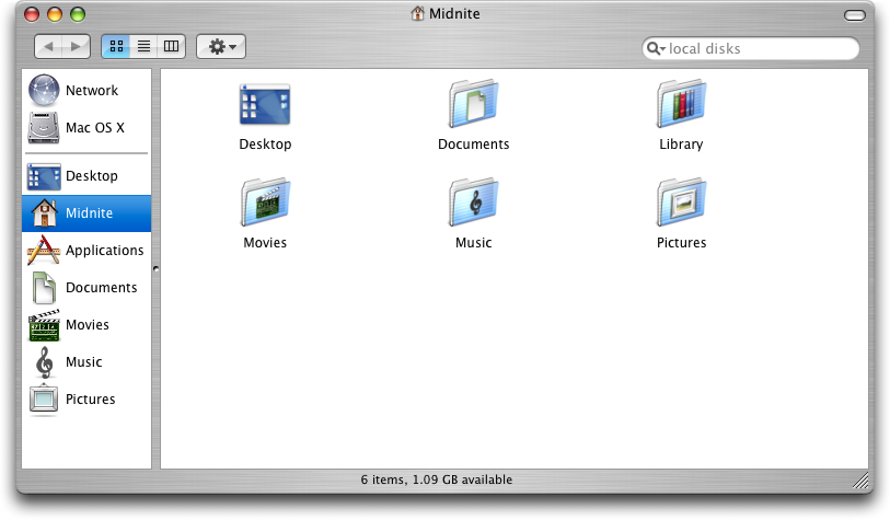
Step 1) The first step is to find and download a basic Mac window. The one I have used is from the previous version "Panther". The new "Leopard" version has change the window about so I can't use it. Anyway, the one I have found was from here. A blanked out version is shown below. I have also removed the small buttons that are present on the window.


Step 2) The next step is to slice up the image into 3 sections. The header, body and footer. I've done this in Photoshop, but nearly any software can do the tick. Cut the image as shown in the image below. If you want to be extra cool (and create a better page) reduce the vertical height of the middle image, this can be done by squashing the image or cropping most of the image out.


At this point on there wont be to many images, just text, so if you get a bit confused because I haven't explained my self clearly enough please leave a comment and I will try and help you out.

Step 3) At this point you should have your three images, it is now time to turn them into a HTML page. The idea behind this is that the centre part of the page is allowed to stretch and then the bottom and top images added (purple). Small divs will be inserted inside for the text (green), as shown in the image below.


There for the first step is to create the blank html page. Add in a head, style and body tags and properly close them. I would show you here but blogger makes it difficult to add such html (even as a quote) it screws it up. Showing an image is just annoying.

Step 4) The next step is to define the main divs. Open a new text file and save the document as .html. As a practice I use is to create the shell, make sure that it works and then add in all of the detail last. Create 4 style elements within the style tags. Add the following text:

body {
font-family:"Lucida Grande",Geneva,Arial,Verdana,sans-serif;
font-size:12px;
font-size-adjust:none;
font-style:normal;
font-variant:normal;
font-weight:normal;
line-height:18px; }

#outerwrapper {
display:block;
width:813px;
margin:auto; }

#header {
display:block;
background:url(http://i5.tinypic.com/8gdsu4l.jpg) no-repeat;
height:38px; }

#mainbody {
display:block;
background:url(http://i15.tinypic.com/81068gl.jpg) repeat-y;
}

#footer {
height:57px;
display:block;
background:url(http://i14.tinypic.com/8e0ujyw.jpg) no-repeat;
}


The body style will apply to the whole page, this is the font styling this isn't need right at this minute. The outer wrapper style is used to house all the remaining elements, this also enables the whole thing to be centered. The header, main body and footer are all styles with background images. The background images are hosted on tinypic for ease of use. They all have different sizes and different repeats to enable this effect to happen. If you want to find out more go visit the w3schools webpage for more information.

Step 5) We have our styles we now need to add them to the page. If step might be a bit difficult to explain due to the blogger restraints. I will try my best. The first div to add in the body of your text is the outer wrapper, add div id="outerwrapper', makes sure you close the tags with the appropriate tags (<>) and the trailing end div tag (/div).
Within this div add the header, main body and footer div's in the same manner. If you view the page in any browser you should end up with something that looks like this.


The middle part doesn't appear since there is no information inside the div, as a result it doesn't appear. The top and bottom images appear due to the size constraint set.

Step 6) The next step is to add a main piece of text. This will be done inside a div so the dimensions and placements can be sorted. Within the style sheet add a new style using the text below.

#text {
display:block;
padding: 0 25px 0 25px;
}

Step 7) The reason the padding is added will be come apparent in a second, is it used so the boarder of the image doesn't have text on top of it. To add in the text div place it in between the mainbody div and its end tag, use the same formatting. To test the div out head over to the lorem ipsum generator and copy and paste some text in the text div. If you have added in the divs correctly you should have something that looks like this.


Step 8) The last steps are to add in two divs for the title and the footer for dates or something similar. To do this add in the following styles. These are for the divs. The styling is added so the elements appear in the right place.


#title {
margin:auto;
width:500px;
padding:5px 0 0 0;
text-align:center;}

#bottom {
margin:auto;
width: 500px;
padding: 12 0 0px 0;
text-align:center;
font-size:10px;}


Step 9) The final step is to add in the required divs. Place the title div inside the header div and the bottom div inside the footer div. Add some text to test if it works. If all is correct it should look something like this.


If it doesn't look like that try downloading the source pack and looking at the html file. Alternatively you could download Firefox, as this will render the CSS correctly, Internet Explorer doesn't do CSS well.

Cool Website Feature - Lightbox - And Implemented

Jan 15, 2008

Hey

I always like cool little features that are present on websites. It makes them uniques or very cool when they are implemented correctly. One of theses such things is a bit of CSS and javascript that is used to create a "lightbox". You may have seen it on your internet travels. lightbox is a bit of code that opens an image on the page in its own little div elements. As well as this the background is blacked out to a certain level. I think it is really cool, so I decided to share it with you. An example of the lightbox is shown in the image below.


If you want to try it out you can go to the lightbox webpage and download the all the code. There is an earlier version that can be used but it doesn't look as cool. I have also added the code on this website and if you click on the image below you should be able to see the test in all its glory. It takes a couple of seconds for the image to load. If you do get impatient just click the loading icon and it should close the image overlay.


I am not going to be able to make every image lightbox compatible as I would have to go through every single page and image and change some of the code. But I will do it on most of the images I post from now on.

Just as a final note I would like to say kudos to GeckoandFly and some page.

3D Text Effects Photoshop Tutorial

Jan 13, 2008

Hey

You may remember if you are a long time regular reader that I did a post about the amazing designs from Shiny Binary. The author if you visit his site is all about the really detailed and the use of 3D text. I was really glad when I found a tutorial by him about how he creates his work. Following through his tutorial I found it really difficult to follow. As well as this he doesn't offer the source materials for you to try it at home, it was part of a magazine subscription. Anyway what I am going to do is produce my own version, and give you a detailed run down of how to do it, I am also going to try and make it so all people of different experiences can follow it. I have included the source materials including the final .psd in a file located here. All the images can be clicked for the full size versions.

Step 1) The first step is to create your canvas. I initially chose mine to the 4000 x 4000 pixels. The bigger is always better. I have mentioned before that the large the canvas the better the detail when it is reduced for the final output. You can change this size to suit your needs or speed of your computer.

Step 2) On the background layer add a blue gradient using the gradient tool (G). Set it using the tool bar at the top to radial. Have one colour value lighter than the other.

Step 3) The next step is to import the images from Xara 3d. Xara 3D to my surprise is a very good program for making 3D text. After you have learn't the basic steps you can create any type of 3D text you want. If you are going to use the program your self make sure your export each of the letters separately and at a different angle. If you don't want to use the program you can download the files (2k x 2k) for use in the later stages, these can be found in the source pack. I have removed the demo background from the files, for your convenience.

Step 4) Go to File > Place and select the first letter. This will place the image into the document. Press the tick in the tool bar or press enter to finalize the placement. The default will do now. In the layers palette (Windows > Layers) right click on the layer and select rasterize, this will remove the smart object status and lets use modify the layer. Use the magic want tool to select the grey and delete it. Finally move the layer into a suitable position.

Step 5) Repeat step 4 until all of the letters have been inserted, place and resize them on the canvas appropriately.


Step 6) The next couple of steps will use the layer mask option. To keep things organized we are going to group layers. Select the first layer and go to Layer > New > Group From Layers. rename the group and proceed to do this for all of the letter layers. Each layer should now be in its own group.

Step 7) The feature of the 3D text is to have letters being in front and behind other layers at the same time. To achieve this we are going to use layer masks. Layers masks are used to hide and unhide parts of a layer. It is similar to the eraser tool except all of that layer is kept intact. To achieve this overlapping feature select the first letter go to Layer > Layer Mask > Reveal All. Use the black brush (black hides, white shows) and delete parts of the text. Repeat the process and adding a layer mask for each of the letters. You should end up with something looking like this.


Step 8) Layer masks are going to be a big feature of these piece of work, hence why folders were added. The next step is to mask off both the side and front of the letters. The first step is to create a new layer. On this layer add a mask but set it to hide all instead of reveal all. Then use the magic want to select the white face the the letter layer. Reselect the mask layer and use a white brush to paint in the front shape. Do this for all of the layers. You should, if you look closely at the layers palette, with something like this. Repeat for all of the layers.


Step 9) The same thing needs to be done for the sides of the shape. This can be a bit tricky but I have found a method to enable you to complete it. Create a new layer and add your mask, as before. One the text layer use the magic wand on the background of the layer, this should select everything but the letter. Then, press shift and click on the white front of the text. Go to Select > Inverse and paint, in white, the side of the letters on the mask. Repeat for all of the layers.

Step 10) Using the layer for the side of the text, add a shadow. Use a large soft brush and lightly paint black onto the layer. If you have the clipping mask set up correctly, to should just paint on areas on the side of the text. Repeat this for all of the layers, adding shadow where areas overlap.

A clipping mask (which will be used layer and is similar to the layer mask) is not used as this would apply to the whole layer. We want something that only applies to a small area.


Step 11) Create a new layer above the background layer and add a small soft shadow to the background of the letters. The shadow starts to bring the piece to life.


Step 12) The front of the letters will no be coloured in. Using the layers as set up before, use the gradient tool to apply a gradient to the layer. The layer mask enables the text to only be applied to a certain area.


Step 13) Do this to all of the layers. Use the paint brush tool to add in small shadows.


Step 14) The final step is really up to you what you want to add to the front of the layers. The best way to do this is to create a new layer above the colour, add you content and then right click on the layer and add a clipping mask. Some places to get really cool vectors include Go Media, these sell vectors but can be used in photoshop.

Step 15) Add some background elements if you want, and you can then export your file. To export go to File > and then either Save As or Save for Web.

The more time you spend the better the final image will be.


I really love the effect, a bit later on I may spend more time and create a better one. If you want more inspiration go to the Shiny Binary website where you can see all of his master pieces. You can download the final source pack which includes all of the images files used and the final .psd, it can be found here.

PaperBird - Little Birds To Play With

Jan 11, 2008

Hey

When I came across this website, I loved it. The website is called Paperbird, and as you might expect it is a small site that has two wonderful designs for little paper birds you can download and print out. I just thought I would mention it as the designs they have are really cool and interesting, and so cute.

Elite By Design - A Website To Check Out

Jan 9, 2008

Hey There

While search the internet I came across this cool website Elite By Design. It is a simple website, updated regularly, which gives you loads of different tips and tricks, on nearly everything. I like visiting it, I have found some really cool tricks from viewing the articles he has written. It is a really clean website and I think it is great. He also wrote about me, so its good to return the favor.

Creating A Fast Moving Car - Photoshop

Jan 7, 2008

Hey

I don't no how I decided to do this tutorial, I just wanted to fiddle about with cars and make them look like they are going fast. I wanted this tutorial to use a lot of filters and techniques but it didn't quite pan out as I hoped. You do get to use the motion blur tool a lot. I will also show you the technique of quick masking. This is very useful and it can be used on an infinite amount of different projects. Anyway. This tutorial will use photoshop although I reckon you can use it in any photo editing software that has some advance features. Click any of the images to enlarge.

Step 1) The first step, as always, is to open and prepare your canvas. I've used the Aston Martin from here. Be warned if you have a slow internet connection the image is rather large. Large images are always good. You can use any car you want although it does need to be side on. Reduce the image size if you have a slow computer.

Step 2) The car is centre of the image, we need a bit of room in the back part of the image for the added effects. This is very simple. Use the marquee tool (M) to select the car. Use the move tool (V) to move the car to right hand side of the canvas. The second step to complete this move is to repair the background. Use the marquee tool again to select a small area of the background that you want to copy. Copy this (Cmd/Ctrl + C) and paste it onto the canvas. Use the transform tools (Cmd/Ctrl + T) to cover up the gap. Merge these two layers together. (Cmd/Ctrl + E).


Step 3) When most cars move the wheels spin. This will be the next step. Use the circular marquee tool and select the silver part of the wheel. Copy and paste this onto a new layer.


Step 4) On this new layer go to Filter > Blur > Radial Blur. Change the values about, there is no preview for this tool so when you click ok and it doesn't look right you have to undo the blur and try it again. If you want to improve the quality of the blur set the quality to best. This will take longer to computer though. Use the value of 8 if you have the full size image. Otherwise chose a value that will look best.


Step 5) Copy and paste this layer and place it onto the front (or back) wheel.


Step 6) Since every wheel blur is on a new layer this step will be easy to complete. Copy and past the blurred wheel layer, move this using the move tool (V) into a position behind the original wheel. Reduce the opacity down .


Step 7) This is where the motion blur will come in. Go to Filter > Blur > Motion Blur. Set the angle to 0 degrees and the distance to about 200 pixels. If you have reduced the image size change this size so the wheel looks blurred.


Step 8) Repeat this for the other wheel. Merge the layer together.


Step 9) This is where the quick mask tool will come into effect. Quick mask, if you don't know is a cross between the paintbrush tool and the marquee tool. Quick mask is entered by pressing a button under the colour swatches into tool bar or pressing Q. You only have to colours now availble. Black and white. Every time you paint using any of the tools (in black) availble you produce the red effect as shown below. Red means the areas will not be selected. This is s bit counter intuitive to me.

Anyway, paint the car or the background red using the quick mask tool. You want the car to be selected so you may have to inverse the selection when you come out of quick mask mode (by pressing Q or the button again). Inversing the selection is done through the Select > Inverse option. The painting doesn't have to be perfect as it will be blurred later.


Step 10) Once you have selected the car using the quick mask tool copy and paste this onto a new layer twice. You will need to use the car outline a couple of times and if you accidentally clear your clipboard it will be a pain since you have to re mask the car. If you keep one on a new untouched layer you can use this one as reference. You can delete if later if necessary.

With the new car layer move it using the move tool (V) to the left of the car, similar to the first move. Add a motion blur.


Step 11) Repeat this process increasing the motion blur and decreasing the opacity. Do this about 3 times.


Step 12) One thing I did notice was the headlights become a little washed out. This is easily remedied. On a new layer paint over the head light using the brush tool and white as the colour. It doesn't have to be 100% accurate.


Step 13) Use motion blur once again, apply a bit of an angle.


Step 14) This needs to be ever so slightly transformed. This is a bit of an optional step. Transform the select (Cmr/Ctrl + T) and the select the warp tools Edit > Transform > Warp, or click the little button by the Yes/No tick and cross.

Transform the blur to add a bit of an effect.


Step 15) Repeat a similar process for the wheels but using lines for highlight. Do this for both wheels. Adjust the opacity if necessary.


Step 16) At this point the car is moving "fast" but the background looks a bit boring. So we are going to remove it and add one. Go to the orginal car layer (hide the other layers) and use the quick mask tool to select the background (or the car I get mixed up what the quick mask selects) and delete this.


You can unhide the other layers when done.


Step 17) At this point I wanted a country road so it could look like the car was wizzing by. Could I find one. No. I spent ages looking. So I had to do with one of this building. You can pick a background but it need to be "side on" a bit like the car. The photos I found were from every direction but no from the view I wanted. If you want to use the one I have used you can find it here. Insert it into the canvas (copy and paste, new layer) and adjust it as necessary.

Step 18) Objects in the background are usually out of focus. To apply an out of focus effect. Select the background image layer, go to Filter > Blue > Gaussian Blur. Don't set the blur two high .


Step 19) Apply a motion blue to get the whizzing by effect.


Step 20) Export the image if you want to use it and you are done.

You can click the image below for the full version. After finishing the car does look a bit to blurred. But it is a good technique and it can be applied to nearly anything.


Please leave a comment, optionally you can download the .psd using the link below.

HavenWorks - The Worlds Best Designed Website

Jan 5, 2008

Hey

I've meant to do this post for a long while, it was only recently by looking through my post-it notes have I remembered to do it ( I should have used a task manager). This little website gem is probably one of the worst design websites on the internet. I was being sarcastic by the title if you haven't realized. HavenWorks, I think, by the massive amount of information on one page, is about something to do with politics especially stuff about elections.

To make this post longer and to point out the fact that there is many areas that could be improved, I will do a short list of the problems with HavenWorks.

1) It seems to be one page. There might be more, there is slightly to many links to find out.
2) They clearly don't have a sidebar. Many web design guru's would be having a fit.
3) Slight over use of web safe colours. People monitors, I think, can cope with the 16 million colours that are available.
4) Overuse of mini-icons.

Anyway, enough bashing of HavenWorks. This post was design to be a little light comic relief. Below is attached an image of the website. I wanted to do the whole page using screen-grab, but for some reason it never wanted to save. The page must have been to large.

Energy Beams - Photoshop

Jan 3, 2008

Hey

Energy beams are rather cool, and very popular for the sci-fi theme (or any theme) picture. This tutorial is going to show you a simple way to do these energy beams. The principle is very simple and can be used for nearly anything. For this tutorial I am going to use the Kill Bill image poster that I found here. I've changed it slightly to remove the text on the image. I love Kill Bill, and was great when it was re-ran on TV this Christmas. Click any of the images for the full versions.

Step 1) To begin, open up your image you can use the one below. It is a bit clear when the original text was but this image is only going to serve as a demonstration for this technique.


Step 2) Create a new layer above the image, this will serve as the energy beam layer.

Step 3) Select the pen tool (P) and in the toolbar at the top of the page select the 2nd option. This will enable you to draw the pen path and nothing else.

Step 4) Draw a wavy path around the sword. Imagine the path going around the sword, this will be tidied up later on.


Step 5) Select the Brush (B) from the toolbox. Set the thickness to about 6px, add a little bit of blur (hardness) on the edges.

Step 6) Set the colour of the brush to #ffd400, this is the yellow used in the image.

Step 7) Go to the Paths palette (Window > Paths) select work path. Right click on the path and select Stroke Path. Simulate brush pressure, this will make the path thin out at the ends.


Through out this tutorial you may need to hide and unhide the path. This is done by pressing the key combination Cmd/Ctrl + Shift + H. Sometime the path gets in the way and needs to be hidden.


Step 8) In the paths window drag the work path onto the new path button. This will change the state of the path to a new path shape. We need to work with the path a couple of times and we don't want it to disappear, this safe guards this.

Step 9) Use the Eraser (E) tool to remove some of the path that is behind the sword.

Step 10) Double click on the layer and set the outer glow. It really doesn't matter what you select, change the values so your image looks good.


Step 11) Do the same with the inner glow.


Step 12) Create a new layer, stroke the path using the same settings, this will be used for a slight blur.

Step 13) Go to Filters > Blur > Gaussian Blur increase the value so the path is blurred. Reduce the opacity ever so slightly.


Step 14) Create a new layer once again. These are all on different layers so you can adjust the values if you need to later on.

Step 15) Select the Brush tool and select the advance brush options (Window > Brushes). Set the size to 4px. Spacing to 450%. In Shape Dynamics set size jitter to 100%. In Scattering set the Scatter to 1000%, Count and Counter Jitter to the Lowest possible.

Step 16) Stroke the path once again from the path palette. This will produce small dots around the edges. Repeat this step if you think there needs to be more small dots. If you want to find out more about particles check out this tutorial.


Step 17) Create a new layer and a new smaller path around the base of the sword. Reduce the brush size down to 3px, reset the brush so that it is normal and stroke this small path.

Step 18) Copy the layer effects for the first path onto the new smaller path. This is done by right clicking on the layer and selecting "Copy Layer Style". Right click on the new layer and select "Paste Layer Style".

Step 19) Repeat step 17 and 18 with different paths. Reduce the opacities on the layers to get the wispy effect.


Option Step 20) If you find that the blurred layer looks to yellow, you can make it white by changing the layer properties. If you add a colour overlay of white, or off white you can adjust how it looks.

When you are done you can export the image (File > Save As). Its a pretty neat effect that can be used for nearly anything.

About This New Design

Jan 1, 2008

Hey There and A Happy New Year

If you haven't noticed a new design has been uploaded and put into the site. It has taken me a long while to get it like this and it went through many design phases. This post is going to be all about what is new, and how it came to be like it is today. I can then get back to posting some series posts on design related topics.

The Design

The design took a long while to do, I wanted a design that was well executed, looked good and was interesting to use and look at. I had in my mind a general feeling of what I wanted it to look like. It took 3 iterations to get it look like it is today.

The first design ended up as red, it contained a lot of black and was very dark in appearance. Overall it was a very dark and "sad" piece. Nearing the end of completion I decided that I didn't like it at all. It didn't have the right feel to it. You can click on the image for the full version.


The next one used more lighter colours. This was more along the lines that I wanted. Some of the background Graphics, including the circles, were from Go Media set I bought. Like the previous design it didn't feel right. The graphics didn't seem sharp and just didn't have the "thing" I wanted it to have. As you can see in the image below I didn't get very far into the design.


The final design was then created over a couple of small design sketches of how I wanted it to look. I finally went for the paper options, since a lot of design is on paper. I use paper a lot. As well as this, as I was building it up it just seemed to work.


Whats In The New Design?

I spent a lot of time fiddling about with blogger and the CSS to get the design correct. There are a couple of stupid errors that seem to pop up in Internet Explorer, I have tried to fix them as much as possible but they still seem to persist. Anyway. I will work down the page and try to explain each concept.

The Blog

The main blog has had a couple of upgrades and features added. For example there is a search box at the top of the page. This is provided by Google, you can search both the website and the web from the same box.

Moving down the small date images have been removed and replaced by just text. Each of the image you saw I had to upload individually. The text is easier to manage and of course means you can search by a date if you want a specific blog post.


Finally at the bottom you have a small footer which contains small links. The back to the top link will send you all the way back to the top. Especially useful if you are all the way down at the bottom of a long post. As mentioned previously a better advert spot has been added.

Sidebar

The sidebar of the blog contains one or two minor upgrades. At the very top is a Tag Cloud, a lot of websites have tag clouds. The tags are generated from every time I label a post. It is kind of cool I like it. Below it are the usual Adverts, General Links, and the Blog Archive.


Footer

The final part of the new layout is the footer. There wasn't one of these before, It took me a long while to get this looking perfect. The left hand box shows top posts for the previous week. This is updated weekly by me. The latest comments is a small widget feed that will show you all of the latest comments. Finally there is an about me element. This I think is quite important since you get to know a little bit about me. It is also used to fill up the last remaining box.


To conclude, I hope you like the design. I'll once again resume posting, since Christmas and New Year are over. Over and out.