Great Design

Welcome to Great Design. This website will look at the best designs on the internet. As well as tutorials teaching you how to produce amazing designs and get good looking results.

Amazing Blog Design

Feb 29, 2008

Hey

After surfing the web as I do I have come across a really cool blog design. When I first saw it I was blow away. It seemed so unique and simple. Anyway if you head over to Cocoia, you can find all of the design. As well as this it is also quite a good blog.

Amazing iPhone/iTouch Wallpapers

Feb 24, 2008

Hey

I can't remember where I came across this but it is one of the coolest sites for iPhone and iTouch wallpapers. I think some of these designs are really cool and I wish that some of these could be widescreen so I can put them as my main background.

If you head over to this site your can find all of them. They are updated every so often with new designs. Below is one of my favorites.

New Idea: Massive Mac Desktop

Feb 19, 2008

Hey

I was mulling over an idea a couple of days ago and it was about one large desktop for a Mac (I suppose Windows and Linux to). The ideas behind this is that the desktop is one large desktop but the user only sees a small proportion of it. Its very similar to spaces except you don't have to use any mouse keys to move between them.

The reason behind this is that the user can move quicker. Using the mouse near the edge of the screen the visible screen will move to a new area and preserve the old area. Its similar to moving in a 3D game. I have included an image below of what I thought.

Please leave a comment with your ideas and comments.

Creating An Apple Style Advert

Feb 15, 2008

Hey

This is going to be a simple tutorial which will show you how to make an Apple style advert. Its pretty simple and fun to do. It only uses a couple of effects and as a result you can probably do this within an hour. The source pack is included here if you want all the materials.

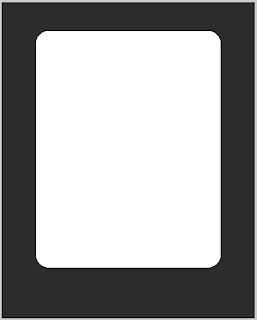
Step 1) The first step is to create your canvas. I have chose a 600 pixel by 750 pixel canvas size. Chose any style you want. Colour the background in #2c2c2c.

Step 2) On a new layer create a rounded square. The corners are 30px in diameter. It can be any colour you want. Align the square with the centre of the canvas by selecting the two layers, clicking on the transform tool in the toolbox and then selecting the align center in the toolbar. After you have done this nudge, with the arrow keys, the square up. This is so you can add in some extra text at the bottom.


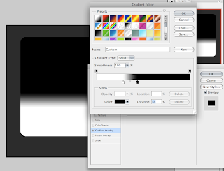
Step 3) Create a new layer again, in the layers palette (Window > Layers) right click on the layer and select clipping mask or you can go to Layer > Create Clipping Mask.

Step 4) On this layer fill it in with a back to white gradient. Move the markers closer together and move slightly to one side. Add this to the new layer. Slightly ignore the image below because I was going to do this as a layer style, but it didn't work with the later steps.


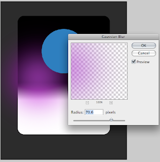
Step 5) Create three new layers. On each layer draw a circle with purple, blue or green in it. Let them overlap the edges and be different sizes. Draw the circles so if there was an imaginary triangle between the three the centre of this triangle is approximately centre on of the square, check out the images below for a better idea.

Step 6) Select a layer and apply a Gaussian Blur, increase the blur dramatically. Apply this to all three layers using the same amount of blur.


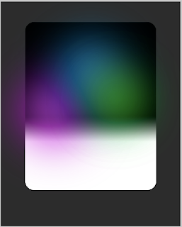
Step 7) Merge these three layers by selecting all three and going to Layer > Merge Layers. Change the layer to a clipping mask.

Step 8) Create a new layer fill this in black. Go to Filter > Render > Lens Flare. Select the default option and adjust the brightness so it appears a medium brightness.

Step 9) In the layers palette change the blending option to screen. Move and transform the layer so the bright part is in the centre of the coloured circles.


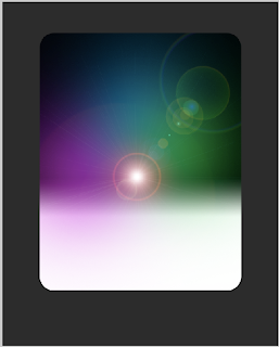
Step 10) Create a new layer, add a clipping mask. Draw in a black square at the top of the rounded square. Add in a small dark grey stroke of 1px to finish.


Step 11) Repeat this process but with white at the bottom.

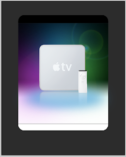
Step 12) Add in the main image. I have chosen an Apple TV. A transparent .png can be found in the source pack. Insert the image so that it is centre.

Step 13) Create two new layers below the image, draw in a dark and light blue ellipse and add a large Gaussian Blur as before.

Step 14) Duplicate the Apple TV layer. Go to Edit > Free Transform. Select the flip vertical option, move the new image so that it lines up with the bottom of the original image.

Step 15) With the new image selected go to Layer > Layer Mask > Reveal all. On this layer add in a black and white gradient so that only the very top of the image is shown. This is also known as a reflected shadow.


Step 16) Finally add in text. I have used Lucida Grande. Change the colours so they fit and look good. The Apple logo was included in part of the font on a Mac and is found by pressing Option + Shift + K. It may be available on other operating systems, have a look at your font maps for more information.


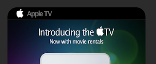
Step 17) You can always finish it off by adding in some small images and extra text. Both of the images below are in the source pack. The very bottom part is a small area for the small print.


It looks quite effect and could definitely be used as an advert. It could do with some minor touch ups. But otherwise it is quite cool. You can download the source here which includes the final psd.

Designing A Magazine Cover

Feb 10, 2008

Hey

This is going to be a simple tutorial to show you how to design a magazine cover in Photoshop. The topic is going to be about photography although you can change it to what ever you want. It is really simple to do and involves a lot of composition and not any advance Photoshop techniques. You can click on the pictures for the full version. The final .psd will be included at the end.

Step 1) The first step is to create your canvas. I have picked A4, although you can pick any size you want.

Step 2) Insert you picture. I have found mine from here. Insert you picture through copy and paste or File > Place. Resize your picture so the main focal point is the spiders head, there is plenty of resolution in the picture.

Step 3) Create a new layer. On this layer select all using Command + A. Go to Select > Modify > Contract, reduce the size by about 15 - 20 pixels. Reverse the selection using Command + Shift + I. Fill this selection with white using the paint bucket. This is used as a small white border.


Step 4) Working from the top down, insert some text. I have chosen Lucida Grande. Make the first half bold and the second half normal. It just adds a little to the effect. Add a drop shadow for that extra effect.


Step 5) Since "Photouser" sounds a bit dull I have added a small amount of text. Keep your colour scheme to a minimum of of about 3 colours.


Step 6) Add a small amount of text above the main header and a tag line below.


Step 7) Create a new layer above the current layers. Using the marquee tool to draw a small box along the top of the piece. Don't go into the boarder. Fill this with red.

Step 8) Using the rounded shape tool with a 40px corner insert a box that takes up the other half of the piece. Fill this yellow.

Step 9) Add in some text, add a small drop shadow to any text that since black. I have added 3 small ticks to give the list an extra feel.


Step 10) On a new layer draw a yellow circle. This will be used as a small sticker.

Step 11) Using the marquee tool cut a piece out of the circle onto a new layer. Use the transform tool to move this away from main circle. Use the paint bucket tool to colour this a light yellow.

Step 12) Use the transform tool to flip the piece. This is done by right clicking on the layer and selecting flip vertical.

Step 13) Add in some text. I have got a bit bored here so I have justed added in Lorem ipsum. Add a drop shadow to the circle parts to set it off.


Step 14) Continue working down the page. Add in some text. The larger part in white is size 20pt, the yellow mini text is in 12pt. The very small text is in size 6pt. Space the text out so it looks good.


Step 15) The penultimate step is to add in the big piece of text at the bottom of the page. This is done in a very similar way to the main text. Add in a small amount of text below. The image on the right is taken from here. Use the magic wand to delete the white background.


Step 16) The final step is to add in a barcode. I have taken one from here.


It looks cool and could probably be used on an actual magazine. You can find the source here.

I've Released A New Site

Feb 8, 2008

Hey

This is just a quick post to say that I have released a new site. Its call Mac Tricks And Tips, and if you havn't already guessed is all about Mac Tricks And Tips.


I have spent a lot of time developing and messing about with the design and layout of the blog. It took me a long time getting the composition of the design right. The result have come out great. I've decided to do a Mac on since I love Mac's and use them all the time. I wanted to post and share all the tips and tricks I have found and developed over time and share them with people.

In the mean time expect a cool tutorial on designing a magazine cover. I was planning on doing it today, but it took a lot longer than planned. As a result I am going to have to push it back.

Adding Adobe Kuler Into Photoshop

Feb 6, 2008

Hey

If you are not familiar of Adobe Kuler it is a website which lets you find, rate and download colour themes. It is very similar to COLOURlovers. This post is going to be about a little application that you can install on your Mac so you can get access to these colour schemes. Its called Mondrianum and it is a small application.

Download and install the application from the website.


Once it has worked its magic, go into Photoshop's preferences. This is probably similar to any other application and would probably work in Illustrator etc. In preferences in the general tab change the colour picker to Apple.


When you select a colour in the normal way you will be presented with these icons. It you click on the icon on the far right this will load up the kular app and let you use Adobe Kuler.


You can scroll through and find the types of colour schemes you want. Very simple.

If you want to download a colour scheme you click the small icon and select the appropriate icon. At the current versions there isn't a direct method to enable you to load the colour directly.

Firebug Great For Web Design

Feb 4, 2008

Hey

There is one tool that I use the most for web design and that is Firebug. It is a simple firefox plugin that lets you dive into the CSS and HTML of a web page to see how it is built and works. It is great for understanding CSS and working out my stuff isn't working as it should be.

What firebug offers is a simple interface pane that appears on the bottom of the screen. You have on the left the html of the webpage, this is used in flippy triangle format so you can collapse great panes of html if you don't need it. On the right you have the CSS this is live, so you can change the CSS and see what happens.

It is a great tool to see how pages work, you can also fiddle about with pages to see why they aren't working as they should be. As well as this they also include script messages, as well as DOM and Net errors. A try developers tool. I recommend it to any designer new or old.

Creating Realistic Fur

Feb 2, 2008

Hey

Animals have fur on them. But how do you make realistic fur. This tutorial is going to show you the simple steps needed to draw realistic fur in photoshop. It doesn't take long to do and the results are really good. There is only a few basic steps but the longer you take and the more detail you add the better it will become. You can download the source pack here with the .psd if you want to use it.

Step 1) Create your canvas. The bigger you make it the long it will take you to create a satisfactory piece. I have chosen for this exercise 500px x 500px.

Step 2) On the base layer scribble in the shape of your fur. It doesn't have to be neat, just a general shape.


Step 3) On two layers brush in with a soft brush two brown colours. Light brown on one layer, dark brown on another layer.


Step 4) Use the smudge tool with a medium size and a strength of 50% to smudge the colour layers. This is going to act as a base coat.


Step 5) On a new layer pick a dark brown colour. Using a 2-3px brush with the airbrush options on start to draw in the hairs. Don't scribble and draw every hair individually. If you want very straight hair draw straight lines, more curly hair is done by making the lines more wavy. I recommend using a tablet for this as the brush strokes would be more natural, as well as easier to do.


Step 6) Repeat this process again on a new layer with a darker brown. Concentrate on the darker areas with the dark hairs.


Step 7) It is starting to come alive. On a new layer again draw in light hairs in the light part of the canvas. Continue to do this with different colours and quantities of hair.


Step 8) The more time you spend the better you will get it to look. The more time and effort will definitely produce good results. Add in extreme colours such as black and white to get a good effect.


Really cool. I might spend some time on a bigger piece and see what the effects are. You can download the source pack here with the final .psd included.