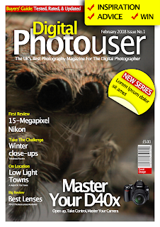
Designing A Magazine Cover
Hey
This is going to be a simple tutorial to show you how to design a magazine cover in Photoshop. The topic is going to be about photography although you can change it to what ever you want. It is really simple to do and involves a lot of composition and not any advance Photoshop techniques. You can click on the pictures for the full version. The final .psd will be included at the end.
Step 1) The first step is to create your canvas. I have picked A4, although you can pick any size you want.
Step 2) Insert you picture. I have found mine from here. Insert you picture through copy and paste or File > Place. Resize your picture so the main focal point is the spiders head, there is plenty of resolution in the picture.
Step 3) Create a new layer. On this layer select all using Command + A. Go to Select > Modify > Contract, reduce the size by about 15 - 20 pixels. Reverse the selection using Command + Shift + I. Fill this selection with white using the paint bucket. This is used as a small white border.
Step 4) Working from the top down, insert some text. I have chosen Lucida Grande. Make the first half bold and the second half normal. It just adds a little to the effect. Add a drop shadow for that extra effect.

Step 5) Since "Photouser" sounds a bit dull I have added a small amount of text. Keep your colour scheme to a minimum of of about 3 colours.
Step 6) Add a small amount of text above the main header and a tag line below.

Step 7) Create a new layer above the current layers. Using the marquee tool to draw a small box along the top of the piece. Don't go into the boarder. Fill this with red.
Step 8) Using the rounded shape tool with a 40px corner insert a box that takes up the other half of the piece. Fill this yellow.
Step 9) Add in some text, add a small drop shadow to any text that since black. I have added 3 small ticks to give the list an extra feel.
Step 10) On a new layer draw a yellow circle. This will be used as a small sticker.
Step 11) Using the marquee tool cut a piece out of the circle onto a new layer. Use the transform tool to move this away from main circle. Use the paint bucket tool to colour this a light yellow.
Step 12) Use the transform tool to flip the piece. This is done by right clicking on the layer and selecting flip vertical.
Step 13) Add in some text. I have got a bit bored here so I have justed added in Lorem ipsum. Add a drop shadow to the circle parts to set it off.
Step 14) Continue working down the page. Add in some text. The larger part in white is size 20pt, the yellow mini text is in 12pt. The very small text is in size 6pt. Space the text out so it looks good.
Step 15) The penultimate step is to add in the big piece of text at the bottom of the page. This is done in a very similar way to the main text. Add in a small amount of text below. The image on the right is taken from here. Use the magic wand to delete the white background.
Step 16) The final step is to add in a barcode. I have taken one from here.
It looks cool and could probably be used on an actual magazine. You can find the source here.


11 comments:
This is a good guide how to not make a magazine cover!
Photoshop is not intended for DTP, I suggest that it should be done in InDesign.
I don't have InDesign, hence why I did it in Photoshop.
ah okay!
Otherwise I suggest that it should be done in Illustrator since it have some of the same feature as InDesign.
Photoshop is for photo and bitmap manipulation, print layout and text manipulation is InDesign.
That looks fantastic James!! I thought the pic at the top was an ACTUAL mag cover!
This couldn't come at a better time as I was looking for inspiration for an eMag project of mine!
Thanks!
Marcus
Send an email to jamespowell100@gmail.com when your done i'd like to take a look at it.
nice tut & gr8 page design!
Looks Awesome! Would pass for any
magazine cover...who cares how you did it! The point is you created something useable!
RB
thax...4 u'r tutlotial :)
Great tutorial!
Thanks for using my photo as an example :-)
Thanks Stavros its a cool photo.
Thanks for a great tutorial. It was exactly what I was looking for. I used ideas from it to put together mock magazine covers for a presentation. Thanks again!
Post a Comment