Great Design

Welcome to Great Design. This website will look at the best designs on the internet. As well as tutorials teaching you how to produce amazing designs and get good looking results.

Fridays Website - Luis Alarcón

Jun 29, 2007

Hey

As part of the weekly ritual of Great Design here is one of the best websites on the internet. Its a Word Press blog with an amazing design. Done mostly in CSS, the header and the layout of the website looks amazing. I can't tell what the page is about. But it does look cool. Click the image for a full version or visit the website here.

 Luis Alarcón
Sorry there wasn't a post last week I was really busy visiting Leeds University.

Creating a Web 2.0 Logo From an Exisitng Logo

Jun 28, 2007

Hey

This tutorial is going to show you how to change any exiting logo into a cool Web 2.0 style logo. This is with cool gradient styles, reflections and interesting text.
For this tutorial you will need Photoshop or similar and and an existing logo (or the one provided). The Web 2.0 pack may also be useful to use, you can download it here. At any of the image you can click on them to see the full sized image.

If you are all ready and seated, lets begin.

Step 1)

The first step is to create a canvas. I use a default 500 x 500 pixel size. A large size should suffice.

Creating a Web 2.0 Logo From an Exisitng Logo
Step 2)

Once you have your canvas find you suitable pre Web 2.0 logo. I've used Digital Points logo. Although any similar style logo would do.

Creating a Web 2.0 Logo From an Exisitng Logo
Step 3)

Place or copy this into the canvas. This would be used as both a reference and suppling some of the shapes used.

Creating a Web 2.0 Logo From an Exisitng Logo
Step 4)

Use the magic wand or the marquee tool to select the logo. In this logo it is the black shape on the left. I've copied this onto a new layer.

Creating a Web 2.0 Logo From an Exisitng Logo
Step 5)

Enlarge and position on the canvas. I've enlarged the image so you can do some fine deatiled work. It can be repositioned later,

Creating a Web 2.0 Logo From an Exisitng Logo
Step 6)

These steps are used to apply effects to the logo. If you download the Web 2.0 pack, you have some of the cool styles already included.

This step involved picking a cool layer style and adding some after effects.

Creating a Web 2.0 Logo From an Exisitng Logo
One thing that is predominantly used is a drop shadow. I prefer a large dark fuzzy shadow. You can change it to suit as needed.

Creating a Web 2.0 Logo From an Exisitng Logo
Looking good. Photoshop is great for this kinda of work. The next step to mimic the work is to add some text.

Step 7)

Web 2.0 text uses a lot of Trebuchet MS, Tahoma and similar sans serif font. Take your pick.

Creating a Web 2.0 Logo From an Exisitng Logo
Step 8)

Again use the Web 2.0 styles to add a layer style. Although this can be done manually having a preset style is quicker to do.

Again in the style of the original i've picked green.

Creating a Web 2.0 Logo From an Exisitng Logo
Step 9)

Again add a small drop shadow to add effect.

Creating a Web 2.0 Logo From an Exisitng Logo
Step 10)

This step is a little tricky if you haven't done this before. This involves creating a reflective drop shadow.

First select and duplicate the layer.

Creating a Web 2.0 Logo From an Exisitng Logo
Step 11)

Reflect the layer vertically and position underneath the original. Slanted logos always look good in this configuration.

Creating a Web 2.0 Logo From an Exisitng LogoStep 12)

Apply a black to white gradient to remove parts of the image. Go Layer > Layer Mask > Reveal all. Added areas of black remove parts, white stays the same.

Creating a Web 2.0 Logo From an Exisitng LogoStep 13)

This is an optional step which you can do later. Crop the image to a more suitable size.

Creating a Web 2.0 Logo From an Exisitng Logo
Step 14)

One of the little features of the original was the little black bars. These are copied from the original although if needed by they could be recreated. Position as necessary.

Creating a Web 2.0 Logo From an Exisitng Logo
Step 15)

The effects look cool. Although with time this could be improved such as the outline of the image It isn't a bad job for 10 minutes work.
Digital Point Logo

Wallpaper Wednesday - Desktop View

Jun 27, 2007

Hey

Its Wednesday and its time for a cool image what you can use for your desktop. This weeks it is the time for a cool image for a view out of a window. Click the image for a full version.

Desktop View Wallpaper

Creating A Web 2.0 Label

Jun 21, 2007

Hey

This tutorial is all about creating and interesting and effective label which you can use to advertise parts of you website. For example you could place this above new content. To see the full image click.

For this tutorial you will need photoshop or similar, and the Web 2.0 layers and gradients pack which you can download here.

Step 1)

Create your canvas, I suggest a large size so you create lots of detail, the final image can be scaled down later.

Creating A Web 2.0 Label
Step 2)

The next step is to draw your shape, this can be any shape. Use the preset shapes in Photoshop or download some new ones off the internet. It doesn't matter what colour it is.

Creating A Web 2.0 Label
Step 3)

Next apply a layer style to the shape, I recommend using the Web 2.0 layers and gradients pack, here. Although you can make your own.

Creating A Web 2.0 Label
Step 4)

As well as this I suggest using a bevel and emboss. Use are large size and reduce the opacity of the shadow.

Creating A Web 2.0 Label
Step 5)

Add you text. I've used Trebuchet MS. Use the character palette to move the letters into a good looking spacing.

Creating A Web 2.0 Label
Step 6)

Again, use one of the white layer styles in the pack and apply this to the white text.

Creating A Web 2.0 Label
Step 7)

You now have a cool looking Web 2.0 label to add to your web pages.

Creating A Web 2.0 Label
Step 8)

One optional step that I suggest adding is a drop shadow, this adds a lifted effect to the label.

Creating A Web 2.0 Label
Step 9)

Flatten and remove the background and save as a .png. This can now be added to any web page.
Creating A Web 2.0 Label
The final label.
Creating A Web 2.0 LabelAs you can see it looks great on any web page.

Creating A Web 2.0 Label

Wallpaper Wednesday - Dark Pipes

Jun 20, 2007

Hey

Its Wednesday and that means it is time for a killer wallpapers. This week is the turn of a moody wall paper which look amazing on a wide screen monitor.
Click for full version.

Wallpaper Wednesday Dark Pipes

Hundreds of Web 2.0 Layers and Gradients

Continuing on the Web 2.0 theme, I have found and complied a large collection of about 200 + web 2.0 gradients and layer styles. These are great if you want a helping hand at creating buttons and layer styles for you website.

You can download the pack here.

For example the image below was a speech bubble shape with a layer style added. An amazing effect done in a couple of seconds.

Hundreds of Web 2.0 Layers and Gradients
As you can see from the preset manager there is a lot of style to chose from to get the best from you creations.

Hundreds of Web 2.0 Layers and Gradients
Hundreds of Web 2.0 Layers and GradientsTo install go Edit > Preset Manager > Gradients or Layer Styles > Import

You can download the pack here.

Creating A Web 2.0 Flag Icon

Jun 19, 2007

Web 2.0 Icons are every where. On websites coming into programs. This icons are graphics that have reflective shadows and look really cool. But how do you do them for country Icons. Heres how. Click any of the image to enlarge them.

You will need:

Photoshop or Similar
A Flag photo
Time

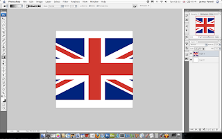
1) The first step is to set up your canvas, I chose a nice large size of 500 x 500 to get the best effect . The bigger the better because more detail can be added to the image.

Creating A Web 2.0 Flag Icon2)

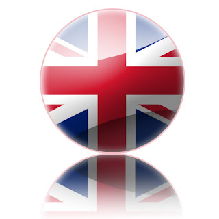
The next step is to find a picture of a flag on the internet. I chose, the Union Jack. Paste this into Photoshop.

3)

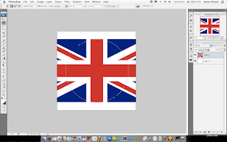
Centre your flag as necessary. You are trying to capture the centre part of the flag.
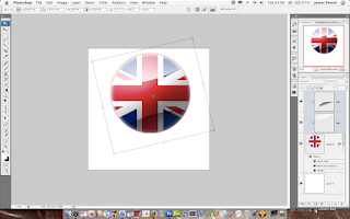
Creating A Web 2.0 Flag Icon
4)

Using the centre marquee tool draw a circle around the centre of the flag. Using the shift key to keep the aspect ratio correct. In Photoshop use space to arrange the circle as necessary.

Creating A Web 2.0 Flag Icon
5)

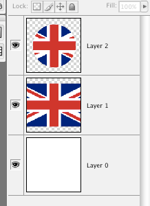
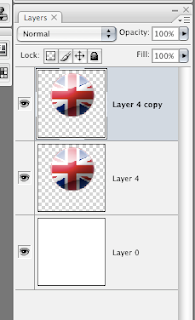
Copy and paste the centre circle onto a new layer. You can get rid of the original flag layer.

Creating A Web 2.0 Flag Icon
6)

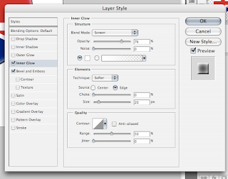
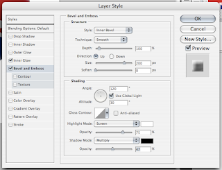
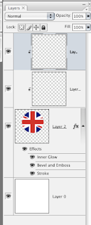
The next step is to add the layer effects to the circle layer. This is done in 3 parts. Inner glow, Bevel and Emboss, and finally a Stoke.

Use the inner glow, set the colour to white and size to 20.

Creating A Web 2.0 Flag Icon
7)

With the Bevel, set the size to 200 and if necessary reduce the opacity of the black. You don't want the shadow to be too dark.

Creating A Web 2.0 Flag Icon
8)

This is usually an optional extra but looks good if you do it. Add a stoke to the layer. The main colour of the flag is used.

Creating A Web 2.0 Flag Icon9)

Once this is done, you have to add the main highlights that give the best effect. To do this create two new layers and turn them into a clipping mask. Two layers are used so you can adjust the opacity as needed.

Creating A Web 2.0 Flag Icon
10)

Using the marquee tool again, draw and ellipse at the top of the image. Add a white to invisible layer on to this clipping mask. Adjust the opacity as necessary.

Creating A Web 2.0 Flag Icon
11)

Do the same with the shadow layer. The opacity of this layer usually needs to be vastly reduced to get a good effect.

Creating A Web 2.0 Flag Icon
12)

Grab both layers and rotate them slightly to the left.

Creating A Web 2.0 Flag Icon
13)

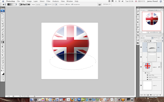
This part is used to create the reflective shadow.

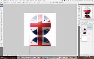
Merge all of the current layers and copy it. You should have two layers. If needed remove the white background.

Creating A Web 2.0 Flag Icon
14)

Flip the layer vertically and position underneath.

Creating A Web 2.0 Flag Icon
15)

Create a layer mask, to reveal all. Then add a gradient fill to gently remove the opactiy as shown. This may take a couple of goes to get right.

Creating A Web 2.0 Flag Icon
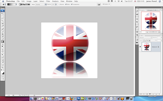
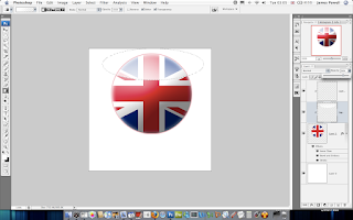
There you go an Uber looking web 2.0 flag icon.

Creating A Web 2.0 Flag Icon
You can of course do this with other flags. And the effects are really cool. Shown below from left to right are: United Kindom, United States of America, South Korea, Earthican flag (Futurama).

Flag icons

Creating A Cool Web 2.0 Icon

Jun 16, 2007

Web 2.0 are those cool icons which you see every where, but do you no how to make them? This tutorial will explain how. Click on any of the images for the full version.

Stuff you will need:

Photoshop (or Similar)

Step 1)

The first step is to create you canvas, this can be any size you want it to be.

Step 2)

Add a shape to your canvas to a new layer and colour it.

Creating A Cool Web 2.0 Icon
Step 3)

Apply Bevel and Emboss to the layer using Size: 200, Highlight white at 100% opacity and a dark blue shadow at 75% opacity.

Creating A Cool Web 2.0 IconStep 4)

Apply a stoke around the shape, in the base colour you picked, size 4.

Creating A Cool Web 2.0 Icon
Step 5)

Apply an inner glow, white, size twenty.

Creating A Cool Web 2.0 Icon
Step 6)

This part becomes a little tricky, you need to create a new layer, right click and create this into a clipping mask. Apple a white to transparent gradient. Adjust the opacity as necessary.

Creating A Cool Web 2.0 Icon
Step 7)

Slightly rotate the layer so its at an angle.

Creating A Cool Web 2.0 Icon
Creating A Cool Web 2.0 IconStep 8)

Again, do this the same for a darker shadow at the bottom, adjust the opacity as necessary.

Creating A Cool Web 2.0 Icon
Step 9)

One of the defining points of web 2.0 icons is the reflective shadow. The method I used is to copy the layer, and remove anything except the white, and reflect it as shown.

Creating A Cool Web 2.0 Icon
Step 10)

Apply a layer mask to reveal all. And then add a black to white gradient, this hides parts of the image, leaving only the shadow.

Creating A Cool Web 2.0 IconStep 11)

As shown you have a cool web 2.0 icon which you can use on your websites.

Creating A Cool Web 2.0 Icon
The cool features of having a simple and effective logo is that you can scale the image to any size.


Creating A Cool Web 2.0 IconKinda cool don't you think. Leave your comments, with your web 2.0 creations.

Amazing Coloured Water

Hey

My friend recently sent me these amazing photos, of coloured water. Over all there is over 20 different pictures.

You can download the whole pack here.

Amazing Coloured Water
Amazing Coloured WaterThere is even more than these in this pack.

Fridays Website - Derek's Gold Mastery Guide, The Real Way to Collect Gold

Jun 15, 2007

Hey

Each week I have brought you a couple of good websites on the internet. This week it is a turn of one of the worst. This website is the page which is been used to market a product, that is probably very good.

Click the image for the full version or click here to visit the website.

Derek's Gold Mastery Guide,  The Real Way to Collect Gold, Fridays WebsiteThere are many reasons why this website is one of the worst tainting the internet. For example it is all one page, look at the length of the image above. The entire website is a page. Normal people would have used a couple of pages, one for testimonials, one for the type of services it offers, one linking to the products description, another page linking to the authors contact address.

This of course poses a couple of problems. On a slow connection it would take an age to load. Even if you have a scroll wheel it would take you a couple of turns before you reach the bottom or the part of the content you want to read.

As well as this the page is also unordered. For example it sort of tells you the same type of information over and over again. In this case it is how much money you are going to make on World of Warcraft.

Finally since this is a product site, trying to sell the ebook offered, the "buy" links which you would expect to be major part of the visuals of the site are small and hidden at the bottom.

As a result this site could be improved many ways. For example it could be broken up into smaller pages. As well as make the font smaller easier to read. There is also a wealth of improvements that would make this site better.

Anyway, next week I will find a website that I will enjoy.

Creating a Modern Business Card.

Jun 14, 2007

A business card is an extension of your self. It is a little piece of you that you give out. In this tutorial I am going to show you how to create a stunning business card to remind people of who you are.

This tutorial will involve Photoshop although it can be done on any application. Click on any of the images for the full size version.

Step 1)

The first step is to set up the business card size. The average size for a business card is 3.5 inches x 2 inches (length x height). You can use any size you want.

Suitably name and save the file.

Step 2)

The first step is to create the front of the card. Use a suitable pastel colour. I've chose blue as that is my favourite. The next step is to add some text. Again going with the modern theme i've chosen Trebuchet MS, any suitable substitution will do.

Creating a Modern Business CardStep 3)

For most fonts, the normal spacing doesn't look quite right. Using the character pallet tool in Photoshop squeeze the characters together. A good compact finish is what is being aimed for.

Creating a Modern Business Card
Step 4)

Most business cards have more than just a name. I've added my website, although you can add anything you want. Phone numbers, address be creative.

Creating a Modern Business CardThe colour I have used is a grey that blends into the background, you want it so you can read as see the text but isn't the most striking feature present.

Step 5)

With the lines guides shown (the light blue lines) you can see that the text characters are not fully lined up. Again using the character tool move the character spacing to a suitable size.

By having the characters lined up the name looks more eye catching, and well designed.

Creating a Modern Business CardYou may have to split up your names into separate layers to be able to align the names correctly.

Step 6)

The next step is to add some sort of logo or widget to the front of the business card. This serves as a graphical representation of you. This could be your personal logo or a shape.

I've picked by creating some circles with different colours inside them. Using the shape tool, these were drawn onto the page.


Creating a Modern Business Card
Different layers were used for different colours.

Creating a Modern Business CardAs you can see the final piece of the card looks interesting as well as modern. The next step is to move onto the back.

Creating a Modern Business CardStep 7)

The back of the card needs to have as much white space as possible, as most people will write notes on the back, filling this up with colour and images doesn't help.

The back of the card needs to be as simple as possible. Again I have used the font from the front and suitably spaced it as required. The simple shapes that were created are used again, but smaller.

Creating a Modern Business Card
If you click the images you can see the full versions.

Creating a Modern Business Card
As you can hopefully see the business card does look stunning as is very effective. Overall this would have taken me about 10 minutes to create.

If you want more ideas for business cards you can see this post here.

Wallpaper Wednesday - Baltimore Turtle

Jun 13, 2007

Hey

This is one of the coolest wallpapers I have found in a long while. Its a turtle swimming. The expression on his face is really cool. Click the image for a full version.

Baltimore Turtle

Cool Icons Of The Web 2.0 World

Jun 11, 2007

Every time you visit a business or some times blogs website most of the time they have and eye catching logo or banner. These are know nowadays as web 2.0 logos. 2.0 being the second generation of the internet after the .com bust.

Below is a selection of the best Web 2.0 logos which I thought were some of the best out on the intertubes.

Website Grader

Website grader
One of favorite websites at the moment this logo is a real star at what can be done to show how cool a logo can be.

9Rules

9 rulesAnother cool logo, this one with a background image and plenty of colour, nothing is worst than a dark monotone logo.

Campfire
Camp fire nowCamp fire is business chat for groups, or so the description says. This logo is a top job for making something look interesting.

Designers Mind

Designers mindOne of my favorite design blogs, and this logo certainly does the website justice.

Veerle's Blog


 Veerle blog
An amazing website with a striking logo. Its one to be proud of.

Pando

 PandoThis websites the features of 3D and shading more than the previous, a very interesting logo.

Spongecell
sponge cell
Probably one of the only web 2.0 that utilizes, and object into there logo name. Again, funky looking and a great logo.

Shutterfly

shutterfly
What makes a striking logo is always little widgets or vector art that is used to add more interest to the text. The little colors and circles make this logo stand out.

Pingoat

PingoatOne of my favourite websites at the moment on the internet. This logo is fun and interesting to look at.

If you found any more cool looking web 2.0 logos, or want to share your views please leave a comment below.

Why Do eBook Sites Look So Bad?

Jun 9, 2007

You see them all over the web. Sites offering eBooks, that are of decent quality but are always let down from the type of website people land on. For example most of these eBooks are from Click bank.

Below is examples of these types of websites.

World Of Warcraft Joanas 1-70 Horde Guide

World Of Warcraft Joanas 1-70 Horde GuideYou can click for a full versions, or visit this link here. The problem with this website is that it is a whole website on one page. For example, there are testimonials, product review, etc. What could be done is split up the page into small sub pages, pretty much like a normal website.

This product may be the best in the world, and probably is since many people have reviewed it and said its worth the money. But the website, in my opinion lets it down, and is a real bandwidth hog for dial up users.

How To Write Your Own eBook


Again another ebook on the web which is probably a great download. Click the image for a full version or visit the full website here.

How To Write Your Own eBookAgain another really long page with no other links than a buy page and other minor pages that have no real value to the eBook.

The problem with this like the one is that it is to long. The result of this is that a person has to scroll a long way down before they get to a buy link. These probably results in a lot of lost sales as people give up on the page before they get to the bottom of the page.

Ultimate Gold Guide

Another World Of Warcraft eBook, I Like WOW, this is similar to the websites above but a lot better.

Ultimate Gold GuideYou can visit the website here. All though not that good because it has all the information on one page, it is shorter and a bit more specific.

All these websites could easily be improved if they added more links, create a more of a navigational system.

To summarize why these websites are not the best in the world.

  • They offer all there information on one page.
  • Hard to read some of the text.
  • Complicated layouts, to much information.
  • Background music (only on some)
Finally, I no that some of these products are good, and I would seriously suggest you should buy them if you think they would help you out.

Till next time, Good Bye.

Fridays Website - Convert Icon

Jun 8, 2007

Hey

Its that time of the week. This week when searching the internet I have found a cool website that offers the ability to convert .png or .ico into any of the two formats. Its really cool if you just need to convert an icon, and don't want to fire up Photoshop or similar.

Convert IconYou can find this website out here.

Till Next time good bye.

Apple Wallpapers

Jun 6, 2007

Hey

This is another installment of the wallpapers series that I seem to be doing. This time the download pack is focused on Apple. The company not the fruit. Included are some custom made wallpapers that I have found while searching the internet.

You can download the whole pack here.

Below are a couple of samples.

Apple Mac Wallpapers
Apple Mac WallpapersYou can download the whole pack here.

Wallpaper Wednesday - Cool Apple

iCal Icon Green June 6th 2007Hey

Its time for wallpaper Wednesday. The weekly feature where I bring you the best wallpapers all over the world / Internet.

This week it is the turn of a Cool Apple Wallpaper. This will soon appear in a pack which you can download.

Click the image for the full size.

Cool Apple Wallpaper

New Calender

Jun 5, 2007

If you want to subscribe to the latest posts from Great Design. You can do so by downloading an .ics file from here. This calender can be read by iCal or other calender application.

Please post below which application you use so I can check this is working.

I will post later how this was done so you can do it yourself.

Edit: You can read how to publish a calender free to the internet here.

Polar Clock

Jun 4, 2007

You may have seen this clock on the likes of Digg. It is simply amazing, watching the loops go round, i've spent hours just waiting for the hour or date hand to move. Click on the link for the coolest clock ever.

Polar Clock Amazing Clock
You can find the real clock here.

iCal Replacement Icon Sets

Jun 2, 2007

I, as usual, have been searching around the web for icons. See my previous post, for the cool icon sets that a Mac use must have.

This time it is different icon sets for iCal. The icons are different variants of the original layout. Included are blue, green, orange and red. These icons can be used for all types of applications, such as the date in the top left corner (A regular feature from now on) .

Each set contain, one for every day of the year , plus ones that don't exist. (February 31st anyone).


As well as this there is also a blank set, to customize as you need.

You can download the whole pack here.

Included:

Blue, Green, Orange, Red Full set.
Blank Icon of Blue, Light Blue, Green, Light Green, Orange, Pink, Red.

The original creators website is located here.

Edit: These have now been changed.

Must Have Mac Icons

Jun 1, 2007

You love your Mac and you want to customize it with out hacking it to pieces, of course the next step is to add some kick ass icons to customize your layout. Present in the list is the must have Macintosh icons to pimp out your desktop. Of course this is not a definitive list and is in no particular order, but are definitively improvements over the native interface.

All of the icon packs can be downloaded in one big pack here.

1) Blend

This is one of a my personal favorites, if you want to more more of a black look out on folders and drives then this is a must have.

2) Application Folders

This icon pack is probably the most used icon pack on my Mac at the moment. It just adds another layer of detail to folders. A must download.

3) Tiger Folders

Although similar in style (Ok, there exactly the same style) these are a bit different and fill in the gaps that the previous collection missed out.

4) External Drives


A very glossy, web 2.0 icon style that looks cool when used for external drives.

5) Hard Drive Icons

This is probably the best Mac icon set for hard drives, there is so much style. A must.

6) African Stamps (Massaimara)

Bored of Mail's Icon, these are a definite replacement, African stamps that improve your dock over and over.

7) Finder

Is your normal Finder getting boring, some of the icons in this set truly make your dock stand out.

Hopefully you will be abble to pimp out your make in style now. Have fun, and leave a comment.

You can download all of the icon sets here.

Dark Wallpapers

Continuing on what seems to be this weeks theme of awesome wallpapers that you must download, is Dark Wallpapers. These are a collection of dark "moody" wallpapers that are interesting and different. Some of these that are included are my personal favourites.

You can download the whole pack of 50+ wallpapers here.

Below are a couple of the best. Enjoy.


You can download the whole pack here.

Fridays Website - Abuzeedo by Design

Hey

Its been a good week for design this time its the turn of Abduzeedo. This website is one of the best I have seen in a long while. Check out the screen shot.


Click for Full Size

You can check out the website here. Till next week keep on the look out for good and bad designs.