How To Create Number Stamps In Illustrator
Hey There
Every tutorial is usually followed by a step number to indicate how far through the tutorial a person is.  These a very useful. But they are not very visual. This tutorial is designed to create a very visual grungy look for use on tutorials. I had an idea in mind for use on my personal blog The Powell Blog. I think there is a very unique style and I want use on these small thumbnails. You can use this tutorial with a similar design for your own site or application (such as a desktop publishing file). If you are ready lets begin.
Step 1)
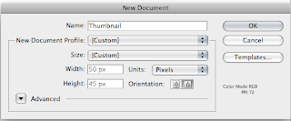
The first step is, of course, to create your art board/canvas. At this point you can pick the size you want to use. I usually pick a size around 50px x 50 px (although I later upscaled this). One small tip, if you usually end up going over the size of the art board, as I usually do, make the size a little smaller. Of course you can usually re-size this later.
Step 3) The next step is to add your font. I've used the Bleeding Cowboys from DaFonts. I like the grungy appearance. Add this to your canvas and re-size it appropriately. I suggest you add this to the middle. Colour it black (or any colour you want). Lock this layer in the layer pallet ( Window > Layers).
Step 3) Most of the work will be done through the use of the pencil tool. Double click on the the pencil in the tool bar pallet on the right and change the preferences. I'm not 100% what fidelity does but a range of about 5 seems to produce good results. The less the amount of fidelity the more points the path will create. I don't want to many (20 fidelity will have the least amount of points).Smoothness generally increases how smooth corners will be. If you imagine a "V" a lot of smoothness will make this look like a "U" where as no smoothness will make look like a "V" (still got that?).
Next I want to create a shape that has some smoothness but still has some points.
Step 4)
The next step is to create a new layer. Place this below the text layer. For this grungy look use the pencil tool to create a shape that has some point but still some some areas. You want to make it look as good as possible. If you don't like it undo and try again. I suggest doing small areas and copying and paste this onto the art board.
One tip to remember, which is always good practice to do, is to close your paths. Press Cmd/Ctrl + J to automatically close the path.
Step 5)
One sort of "feature" of the grunge look is splatter. I've used the pencil tool again to create the small shapes. Take your time at this point. It took me about 20-30 minutes (I wasn't counting) to make all of the shapes. If you want to save time do some copy and pasting and use the transform tool (V) to help you change the shapes.
Step 6)
You can add extra layers of splatter as you want. I've chosen two layers of red using the same spatter layer.
Step 7)
The next step is to create another layer. This will be to use as another layer of splatter. I've chosen a darker green, as it matches in with the style of my website. I always like to have everything ordered into layers.
Step 8)
Using the pencil tool again, create another layer of splatter. For this step I create a small section with the pencil, adjusted the points as necessary. I then copied and pasted this section again and again but rotating it and scaling as necessary.
You want to make this look good. It doesn't have to be exactly like mine. Take your time and you should produce good results.
Step 9)
Export this using the File > Export function. The beauty of illustrator is that it gives good quality results, since it is all vector.
Step 10)
Change the number and repeat step 9 as many times as you want.
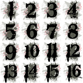
Below are the ones i've created and exported.
Please leave your comments and links to your creations.


5 comments:
After downloading the text file how do i import it into photoshop. Please give detailed instructions. Much appreciated.
What do you mean text file? Ideally this should be done in Ilustrator.
If you want to import something usually you go File > Place and this places what every file into a new layer.
Please leave another comment if you are stuck. Ill try and help out as much as possible.
"I've used the Bleeding Cowboys from DaFonts."
How do i take the Bleeding Coboys text and put it into photoshop so that i can use it as a text for this tutorial.
Thanks for your help!
Forget about the latest post i submitted. What i would like to know is wher do people download additional text for their photoshop packages and how do they import them into photoshop soo that they can use them.
Ok, to install the font down load the file. Unzip it. There should be a file ending with .tff of similar, i can't remember.
If you are on a Mac double click the file, click install font.
If you are on Windows, find fonts in the control panel and drag the file into this window. Restart photoshop if you have it open.
Usually if you google "How to install fonts in X" there should be plenty of information.
Hope this helps.
Post a Comment